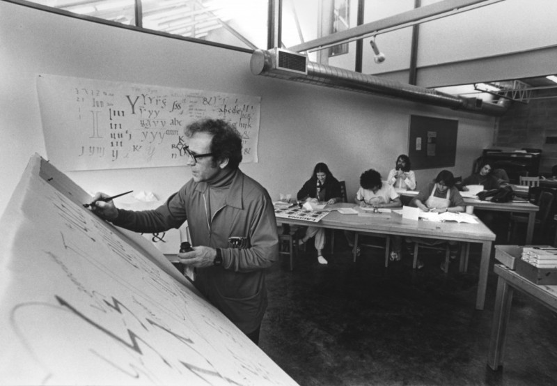
 Robert Palladino teaching in 1978 (Image: Reed College)
The man who inspired Steve Jobs to bring multiple typographic styles to the Mac, the Trappist monk and calligrapher Rev. Robert Palladino, died late last month at the age of 83.
Palladino taught calligraphy classes at Portland’s Reed College, which Jobs attended during his dropout year. Yesterday The Washington Post published a retrospective highlighting the development of Palladino’s art, the encounter between the two men, and the continuing influence Palladino’s calligraphy had on Jobs’ aesthetic vision.
Palladino’s creative journey began in 1950 when he joined a New Mexico monastery at the age of 17. A scribe monk in the Trappist order noticed Palladino’s elegant handwriting, and tutored him in the art of decorative lettering over the course of five years.
Eventually, Palladino left New Mexico and moved to Lafayette, Oregon, where his art caught the attention of Lloyd Reynolds, an expert calligraphist and the creator of the calligraphy program at Portland’s Reed College.
After striking up a friendship with Reynolds through written correspondence, Palladino left the silent monastic life in 1968 to study under his new mentor full-time, before Reynolds retired a year later and left Reed College’s program in Palladino’s hands.
Steve Jobs enrolled in the college in 1972, but dropped out after his first semester. However, the future Apple co-founder continued to frequent the campus and Palladino’s work soon caught his eye. Jobs recounted his appreciation for the handwritten art in his2005 commencement address at Stanford:
Throughout the campus every poster, every label on every drawer, was beautifully hand calligraphed. Because I had dropped out and didn’t have to take the normal classes, I decided to take a calligraphy class to learn how to do this. I learned about serif and sans serif typefaces, about varying the amount of space between different letter combinations, about what makes great typography great. It was beautiful, historical, artistically subtle in a way that science can’t capture, and I found it fascinating.
None of this had even a hope of any practical application in my life. But 10 years later, when we were designing the first Macintosh computer, it all came back to me. And we designed it all into the Mac. It was the first computer with beautiful typography. If I had never dropped in on that single course in college, the Mac would have never had multiple typefaces or proportionally spaced fonts.
“He came back afterwards and consulted me about Greek letters for a type font,” Palladino later recalled for a Reed College 2008 oral history project. “I don’t know if he ever used my Greek letters, or if he just used them as a starting point, but we had a good time. He was educating me about what a computer is, as I hadn’t the foggiest idea what he was talking about.”
Palladino never owned, or even once used, a computer, but recalled Jobs as being “as nice a guy as you could meet,” in a 2011 Hollywood Reporter interview. He also taught other famous students, including typeface designer Sumner Stone, who created the ITC Stone font during his time at Adobe.
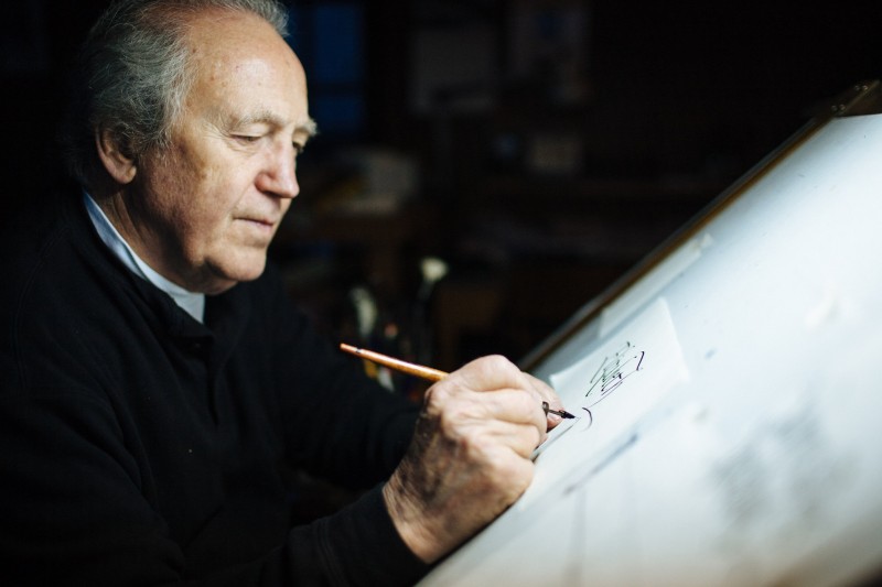
Robert Palladino in his home studio in Sandy, Oregon, in 2012 (Image: Liz Devine)
Palladino taught until 1984 before retiring with his wife to a 20-acre farm, where they raised sheep. He became a Catholic priest in 1995, but worked as a professional calligrapher until his death on February 26.
You can watch Palladino interviewed for the 2011 PBS documentary Steve Jobs: One Last Thing, in a segment covering the artistic influences that shaped Jobs’ character.
[“source-Macrumors”]