 Imagine a scenario where you had many options to choose from and all you ended up with was an increased level of confusion. Yes! That is precisely what the designers go through as one of the biggest struggles they go through is how to choose fonts. Think about it, there are many options and all of them look better than others. As a designer, you have to pick the best that fits the design and reflects the true tone of the brand personality. The reaction to any blog is not just decided by the content, graphics or images but also the typography. Choice of right fonts based on the correct typography rules is essential for inciting specific emotions in the target audience and is instrumental in giving away the primary idea which will actually push people to take a certain action.
The typographic arsenal includes two primary weapons- the typefaces and the fonts! If that makes you wonder what aren’t they the same things, then trust us, you are not alone. Two words have been popularly used interchangeably. This will not really matter to anyone but the designer. Definitely, we know what is going on in your mind right now.
The Difference between Font and Typeface
Simply put, a typeface is also called the font family. This means that the typeface is comprised of many fonts where every font is endowed with a particular weight, style, condensation, slant, ornamentation, etc. The origin of typefaces can be traced back to the 15th Century when various humanist scholars had scrapped various Gothic scripts in order to favor a far more classical mode of handwriting. It is said that many famous fonts like Bembo, Jensen, etc. come from the names of the printers who had worked in that era for improving their designs by use of better typography.
A Font is thus a specific weight and style of a bigger typeface. E.g. Serif is a typeface and Times New Roman is a member of the Serif family. The font has become a popular reference in the daily discussions. However, there are points where the designer is required to furnish the exact details. The font comes from the French word ‘fonte’ which was in use in the Middle ages. Fonte meant something which was cast in metal. Various printers made a cast of the whole letter set to make a font.
Knowledge of the history of the essential fonts which are used in daily life helps in determining their parent typeface families in addition to helping the designers to visualize where it all began and how far have we come. So, if you are aiming for a designer profile, you cannot afford to miss the next piece of information.
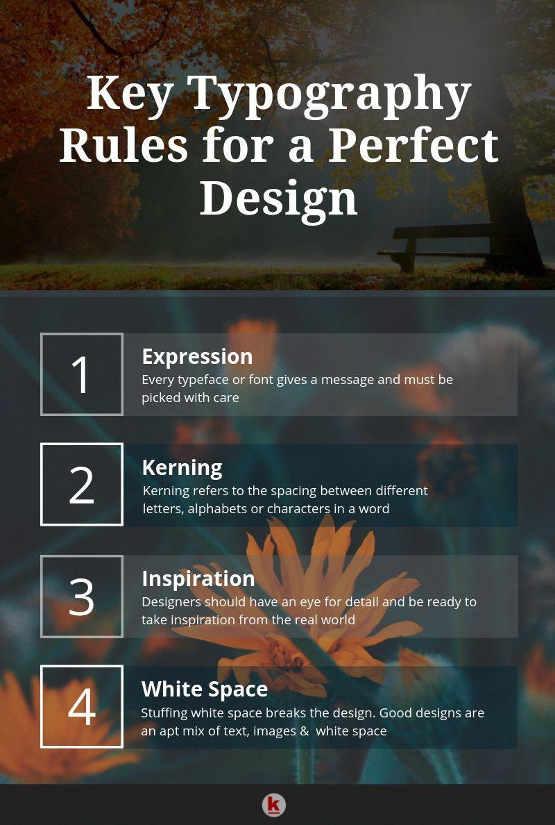
Basic Typography Rules Designers Bet On
- First Come Fundamentals: Yes, you have to begin with the fundamentals questions which strike your mind, about the target audience, implied message of the typography and how will it go down the throat of the audience. Typography can be taken as a marriage of art and science. Once you have the basic concepts in place, there is no point going further.
- Typography Expressions/Communications: At least by now there is no challenge in accepting the fact that fonts and even typefaces at large, are definitely not a random act but have to be adjusted as per the personal choice of the person. Every font will take your message to the audience and thus is never advisable that the fonts are picked without keeping the same in mind. A simple manner to do this is by working on enumerating the connection between the font and the audience. It has been proven in many studies that the typography plays a vital role in engaging the customers and hence building of trust.
- Typeface Mixing: This is one bet which no designer wants to lose. Seasoned designers are already aware of the fact that a thoughtful mixture of fonts has a great impact on the final product design. Remember, every font has a character and has a certain role to play. As a designer, you should be able to play around with contrasts which are presented by different fonts but there has to be no disorientation in the transitions.
- Kerning: It refers to the skill of giving the right spacing between two successive letters in a word. This has been traditionally ignored as you can infer from the certain letters which have bulge towards the outer direction, like W, Y, V, etc. It is the lack of kerning which makes them a little out of sync then the rest of the lot. In the case of the digital fonts, designers often follow the kerning table which has a better explanation of the spacing between the letters.
- Alignment: There is a general tendency in the young designers to pick the Centre alignment which in combination with the justification of the text makes reading harder on the eyes. In contrast, the left and right alignment of text is more easy on the eyes. Justified alignment is considered as a designer blunder as many times it leads to the creation of a lot of unwanted space between the words, leading to a severe crash-landing of the user experience.
- Readability: This is always the prime concern of everyone who cares to visit your website or blog. Do not get carried away by the beauty of some fonts as they can really disrupt user experience if the fonts are not readable. At times the font which holds good for the headline holds no place in paragraphs.
- Inspiration: Typography is a play of the inspired mind. A creative and inspired mindset can bring a lot of novelty to the design which is not something to be found online. A designer should hold specific admiration for beauty in surroundings and an eye for detail. Any attractive encounter should be evaluated from a design view.
- No Font Stretching: This is serious business and you cannot just stretch fonts to add to the appeal as that is never going to happen. Instead, it will break the symmetry and kill the whole design. Stretching of fonts to match the screen size is often a grave mistake done by the designers and it cannot be reversed. Change the font to match the design but never stretch.
- White Space Rule: It is to be put to best use and not just stuffed with images or content. White space gives a breather to the text and the reader. This helps in the promotion of the content and hence conveys the desired message in a better manner. It brings in more sophistication to the design and the spotlight is again turned to what is essential.
Once done with the rules and lets just also dig a bit deeper in the emotional power of fonts. Imagine a good book, for instance, Harry Potter. Apart from the magic, it creates by taking you to a different world, something which is really striking about it is the font in which it is written. Visual appeal is as important as the substance. Every font is associated with an emotion which you cannot override. In a survey conducted by the Software Usability Research Laboratory of Wichita State University a few years ago for studying the link between different fonts and the emotions which they elicit, highly intriguing results were returned. There were certain fonts which were described as being mature and stable while others were fun and Happy Fonts.
So, if you really feel that it is all but a game of words, so you are not wrong. What we have tried to present is a set of rules but true designers like to break the rules and experiment with them factoring in different cues from their imagination. Masterpieces are never created keeping in mind the rule-book. However, the disregard should not be sharp but a flow. Designers at RedAlkemi have always taken care of designs from a detailed perspective to ensure the best outcomes. You may Get in touch with us for any questions.
[“source=bbntimes”]