
As we’ve just closed out 2016, I think it’s always interesting to look back on how your workflow might have evolved over the previous 12 months. It’s often surprising how many of your tools and techniques change over the course of a year.
For me, the stand-out theme of 2016 Design & UX has been the arrival of the Chrome app as a fully-fledged web design option. In fact, I’ve written about three of them in 2016 in this very newsletter.
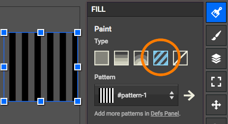
The BoxySVG UI
Back in April, we talked about Jarek Foksa’s BoxySVG – an excellent little SVG editor . Though the app can run in the Chrome browser, it works best as a downloaded ChromeOS app.
In September, I covered Pingendo, a prototyping toolthat delivers Bootstrap-powered prototypes – and another Chrome app. I’ve built two prototypes with this app since then.
Enter Figma
However, arguably the biggest change to my own workflow in 2016 only happened in November when I edited Adam Rasheed’s Is Figma a Serious Option for Sketch Designers? – yet another ChromeOS app.
Now, Adam will tell you he’s an unabashed Sketch fanboy – I mean, he teaches courses on Sketch – yet he came to me excited to write about a web-based competitor to Sketch. At the time, I knew nothing about Figma but became intrigued as I read his first draft.
Figma
Six weeks later I now use Figma every day. I didn’t mean to – it just kinda happened. I have Sketch, Adobe XD, Photoshop and even Fireworks, yet I find I spend more time in a (currently) free web app.
So, Why Figma?
It’s not the UI. If Sketch invented what a modern UI Design tool should look like, Figma hasn’t strayed far from that. Layers on the left – properties on the right. If you’re familiar with Sketch, you won’t feel lost in Figma (or XD for that matter).
Also, Sketch files generally import cleanly into Figma with minimal issues.
But obviously, none these aren’t reasons for switching to Figma.
Is it because it’s free? No. Don’t get wrong – I like free, but I’ve already paid for the other apps so I’m technically losing money by not using them.
No, there’s a more surprising reason (to me anyway).
Figma’s Multi-user Collaboration is a Game Changer
Multi-user collaboration is Figma’s ‘special sauce’ – the only thing that makes it significantly different to use than Sketch, Photoshop or even Adobe XD.
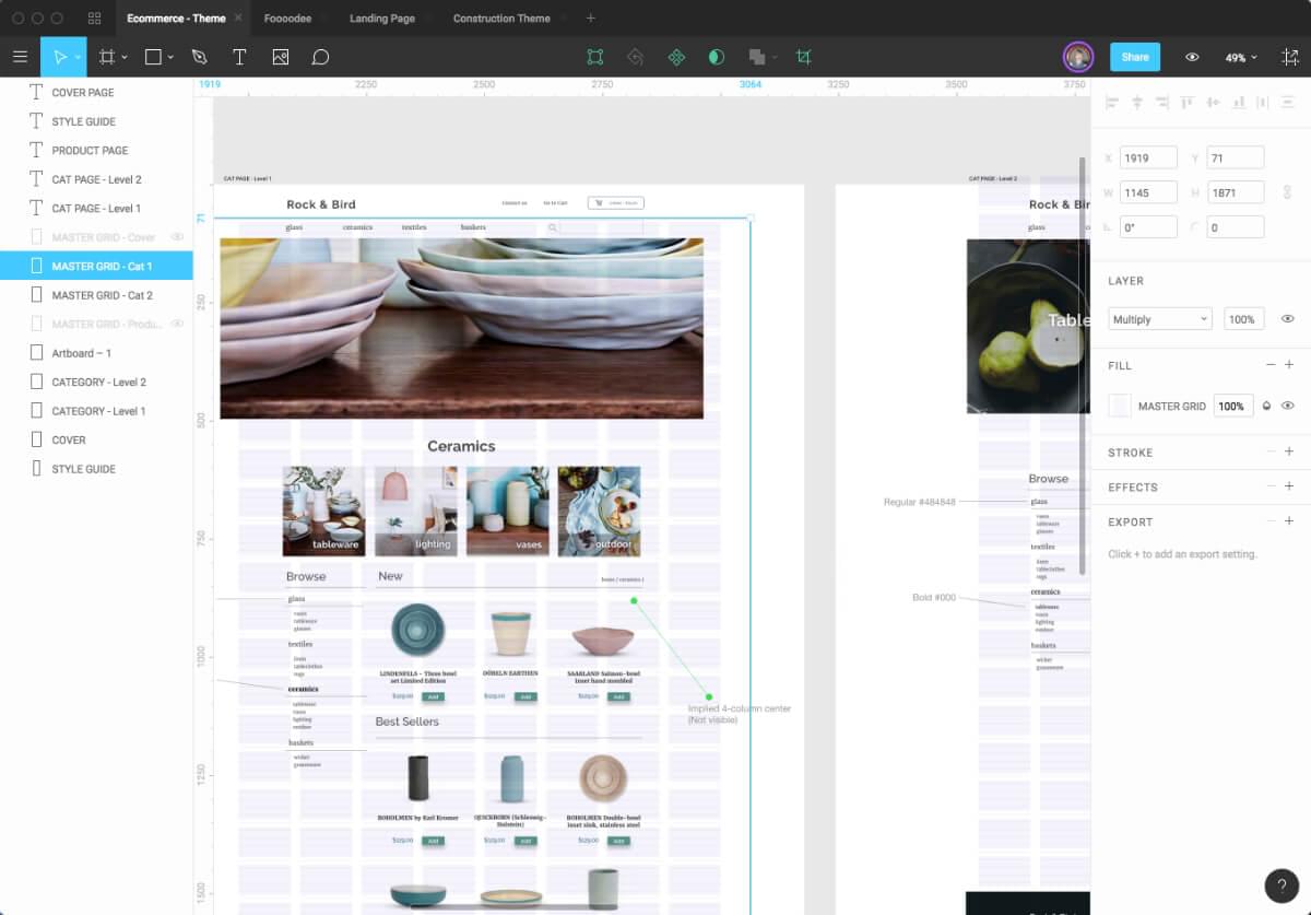
Figma’s Multiuser UI
Figma lets you share design via either URL or username directly from the app. There’s no upload or syncing to secondary cloud service. Figma designs live online – not unlike Google Docs.
This means when two or more users are viewing the same Figma design, you can see the other user’s cursor live – again similar to Google Docs.
And I have to say, when I first saw this, I though ‘Hmm… that’s… cute’.
But over time, it gradually it became clear how incredibly useful this live sharing feature is. Here’s why.
1) Figma Docs are Living Style Guides
When you share a Figma document with a developer (view only access), they then have the ability to click on ANY page element and view its properties in the right panel. That includes:
- font-family, size, weight
- width & height
- line-height & margins
- colors
- shadows & effects

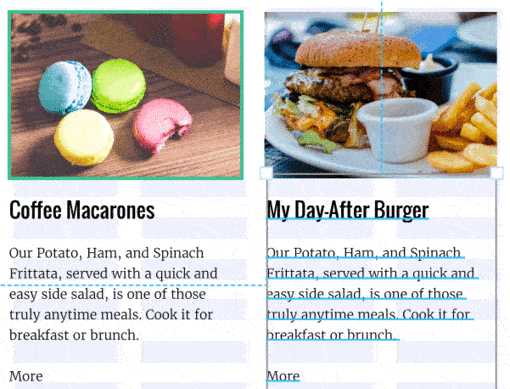
Developers viewing properties with Figma
While this doesn’t replace the need for a good style guide, it certainly gives the developers an easy way to answer almost any question they have about the design.
In fact, I’ve been able to watch our developers in Manila clicking around my Figma design as I’m briefing them on Skype. Figma also has a nice comment/annotation system built into it.
2). Developers don’t need to ask you for small graphic tweaks
Often tiny adjustments are needed to icons and graphics, which usually means looping back to the UI designer. Figma allows anyone with authorization and a browser to tweak and re-export the graphic any time they need to.
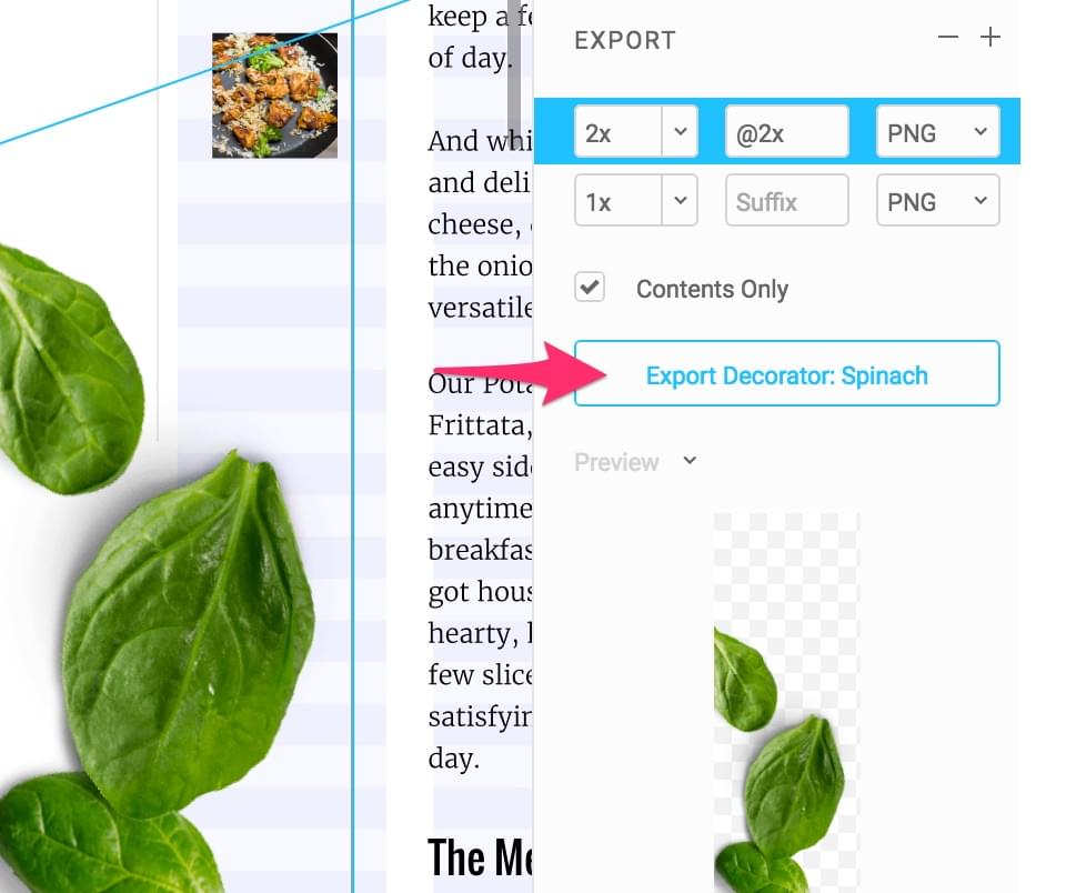
Developers can tweak and re-export graphics when necessary.
What’s more, full version control lets you revert to the original at any time.
3). Project managers don’t need constant status reports
As designers, we often need to spend time updating stakeholders on where a design project is at. With Figma, they can see exactly your design is at and so they no longer need to ask you for constant updates.
When they come to you, you can get straight to the important questions rather than explaining what you’ve done.
Putting a ribbon on it
More than anything, Figma’s multi-user function has got everyone on the same page (pun intended). Project manager, marketers, and developers are in on the design process early – literally watching you work – so they seem to feel more ownership in it. This has been a nice side effect.
More from this author
- UI Motion : Can You Tell a Story with Movement?
- How to Hack Brains with Cinemagraphs
Would all apps benefit from this kind of live collaborative approach? Probably not. I’ve never seen the same thing happen in Google Docs. Web/app design seems an especially good fit.
Nevertheless, seeing the power and sophistication of 2016’s Chrome apps, I’m fascinated to see what people will do with it in 2017.
Originally published in the SitePoint Design Newsletter.