From local train station signages to the bus tickets we buy, we are surrounded by typography. Yet, we don’t often ‘see’ it. Acknowledging and celebrating the typography of Mumbai is an exhibition currently underway at the Kala Ghoda Arts Festival 2020, at the David Sassoon Library, The Army & Navy Foyer and Filter, Kala Ghoda. 16 graphic designers have come together to reinterpret the written word they see around them.
Message Received
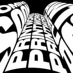
Typography can be defined as the art and technique of arranging type to make written language legible, readable and appealing. The tone of the word or the sentence can be interpreted through the type. Varsha Karale, one of the curators of the Visual Arts section, informs that before digital technology came along, artists would draw types by hand. “They would create different fonts to convey the emotion of that letter. With limited resources at their disposal, they would create fabulous signages,” she says. For instance, she adds, when the types are thick, bold and loud, one knows what tone is being conveyed. “Types deliver the message immediately,” she says.

Celebrating the City
The exhibition has been curated by Alok Nanda, who runs the advertising and design firm Alok Nanda & Company (ANC) based out of Kala Ghoda. “We complete 20 years of ANC this year and we wanted to give back to the neighbourhood and the city we live in. That was the thought behind the exhibition,” says Nanda. The company reached out to graphic designers across the city to play with the types that surround us and represent them in a refreshing way.
“So, for instance, there are numerous xerox shops with signages in black and yellow around us. We see them but we don’t really ‘see’ them. So, if a graphic designer was to show it to you again with his or her own interpretation, you’ll begin to understand and celebrate the typography,” adds Nanda.

See What Surrounds Us
While designer and typographer Chandan Mahimkar’s artwork shows his interpretation of popular restaurant signages, Kudrat Pardiwala, the Creative Director at ANC has interpreted how Mumbai’s dabbawalas do their marking, so they don’t lose the dabbas. Mahesh Rampuria’s artwork shows his interpretation of cinema hall tickets from single screens. “The attempt is to reach out to the general public—the exhibition is a lot of fun. It’s not typography talking to typographers. That would be a very different one altogether—more about the history of the art or who created it. This exhibition is celebrating what surrounds the residents of Mumbai,” says Alok.
Future works
With over 30 pieces, the exhibition is spread across three spaces—the foyer of the Army and Navy Building, Filter, the design shop at Kala Ghoda and David Sassoon Library. The response it has garnered from graphic designers has inspired Nanda to move the typography exhibition online as a permanent exhibit, post the Festival. “The city’s typography will keep changing and we will keep finding newer things to interpret. I think it will be a good idea to keep inviting designers to do that, but first, the Festival is the focus,” he adds.


The Typography exhibition is ongoing at Army and Navy Building, Filter store and David Sassoon Library as part of the Kala Ghoda Arts Festival 2020 till February 9, 2020
[“source=architecturaldigest”]