I’ve rounded up 23 examples of websites using duotones (or sometimes gradients, colour filters or a classy monotone / grayscale).
There are various reasons these effects abound, notably allowing informational websites to use authentic photography without distracting from navigational elements or important copywriting.
Duotones can establish a colour theme for an agency website, for example, and help to liven up what can sometimes be quite basic website designs.
Before you scan through these examples for inspiration, why not bookmark the rest of our web design trends for 2017, including reduced primary navigation, ditching the hamburger menu, and meaningful motion.
Chris Redshaw
Look at Chris Redshaw! What does he do? Presumably something with design and direction. Whatever he does, I’m convinced he does it well, given how beautiful he looks under this yellow filter.

Evoluir
Evoluir’s website isn’t exactly to my taste, as it uses some tricksy scrolling and ‘floaty’ geometric shapes.
However, the duotone backgrounds used are certainly impactful, conveying plenty of humanity without being too busy.


LPK
Showcasing agency work can lead to slightly messy web design, as different logos and creative clash, whether on the same page or on a slider.
LPK mitigates this effect by applying colour gradients, duotones and filters to its slider. I think it creates a high quality aesthetic with photography that might otherwise underwhelm.


Social Chain
Social Chain is a great example of an agency using simple duotone background images to give that ‘print’ feel to a basic hamburger and scroll website.
The website’s homepage goes further and uses duotone video of agency staff larking about, helping to paint the picture of a social agency that has fun.

Host
A simple grid of squares makes a very cool navigational aid, especially painted in apple red with alternate squares carrying colour-filtered photographs of each city.


Andover Fork Truck Services
Who doesn’t love a fork truck? And who doesn’t love a splash of mint green?
Andover Fork Truck Services livens up a perfectly serviceable black and white background image with some on-brand colouring.

Coup de Coeur
A pink and red duotone used on homepage and across artist images perfectly complements the Coup de Coeur brand (which I think means ‘crush’).


Internetum
An agency once again using a duotone to give an instant impression of mythic creativity.

Jargon Free Fridays
Duotone-tastic, these backgrounds give full force to the central message on the page.


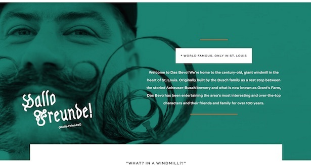
Das Bevo
With its jaunty autoplay sound and animated sails, this website for a windmill events venue is not everyone’s cup of tea.
I loved it, and not just for the colour filter applied to both windmill and moustachioed fella.
Venue websites can often seem a little anaemic, failing to give a sense of fun – none such accusation here.

Daniel Marshall Architects
I love this website. DMA’s projects scroll by in elegant grayscale, with a mouse rollover revealing them in vivid colours.
Forgive me for not making a GIF, just click through and have a play yourself. A wonderful way to use an elegant restrained pallette whilst livening up browsing.


Adison Partners
Another slider given some pep with a blue-purple filter.


Transmeet
No colour here, but an interesting example of a video background in low-fi black and white.
Though video backgrounds are a divisive element of homepage design, in this case the company is a video production company, and therefore this compromise makes a lot of sense.
A quicker loadtime and less intrusive movement come from this stripped back video style. Clickthrough to view.

Chunk
This Dutch agency uses neon colour gradients, giving the bold black header copy maximum punch.


One Republic
I think this is some kind of band that the kids like. And why wouldn’t they, given the band’s website and its use of colour filters and gradients?

Winter Capital
Winter Capital is another professional website that confers status with the use of black and white background images, this time using a subtle split-screen filter.

Adaptable
Adaptive uses a dark blue filter on its header, with white text and white button sharply picked out.

Semu Design
Grey sophistication.

Lipman Burgon
A simple black and white image gives Lipman Burgon & Partners’ website a veneer of gravitas.

Motome
Another very subtle and simple way of jazzing up a page with one primary use and search field. The image doesn’t have to be all-singing, all-dancing to make a difference.

Owen O’Donell
Owen’s site has one big call to action and a hamburger menu. The chunky text says it all, ‘developer’, and the black and white background lends some personality.

Chinatown London
The last of our black and white examples. A big header like this sets the tone before the user delves into detail, further down the scrolling homepage or in the header menu.

inherQuests
Pink for the win.


