Is your store looking dated? Are the displays around your shop looking a little too ho-hum or lacking inspiration?
In the day-to-day of running your store, it’s easy to overlook its optics. Freshen up your store by adding some of the most popular retail store design trends, according to advice from The Association for Retail Environments. Here are nine hot trends they’ve spotted globally, and ideas for using them in your store.
Hot Retail Store Design Trends
Raw, Unfinished Materials as Store Fixtures
Try incorporating elements such as cardboard, old wooden crates, pallets, sheet metal or tin, and re-purposed wood into your fixtures. These materials are a natural for a homespun shop like a yarn or crafts store, but can also add a humanizing element to an otherwise high-tech space.
Plant Life
Adding greenery around the store adds texture and brings the outdoors in, which creates a more soothing environment that encourages people to linger. Be mindful of allergy sufferers and choose allergen-free plants or use high-qualify artificial plants instead
Textural Finishes
Finishes that please the viewer’s senses, such as rugged wood or brick, real or faux stone, velvety display covers or thick carpeting, create variety in your space and make your store more welcoming.
Mood Lighting
It can be worth hiring the services of a lighting designer to use lighting effectively as this is one of the greatest retail store design trends. Not only is lighting critical in highlighting key areas of the store and drawing shoppers in and around, it also creates an ambiance that can enhance the store experience and brand. Whether it’s bright and lively or moody and seductive, lighting makes a big difference.
Chalkboard Finishes
Borrow this fun, casual concept from restaurants and breweries: Get some chalkboard paint at your local home supply store. Paint it on a wall, door, easel or fixture and you’ve got a surface for creative expression (and today’s sales).
Eclectic Design
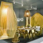
Uniformity is out. Today’s cutting-edge stores mix a wide variety of styles, furnishings, and scale. You might combine “shabby chic” display tables with sleek, abstract artworks on the walls, for instance.
What keeps eclectic design from looking like a hodgepodge? Repetition of key elements unifies your retail space and draws customers inside. For instance, repeating the same three colors can unify disparate furniture styles.
An eclectic style can look cluttered. Help guide customers through the store by using disruptive elements that stand out and attract attention. Posing striking mannequins at key points in the store, placing a neon sign over the checkout counter, or having a bright-colored carpet path that traverses the store are all disruptive elements to attract attention and guide actions.
Immersive Experiences
Make customers feel they’re entering a different world when they come inside your store. Use music, light, colors, materials that invite touch, and even scent and taste (refreshments) to create a mood that keeps people shopping.
What new retail store design trends have you added to your store lately?
Produce Store Photo via Shutterstock


