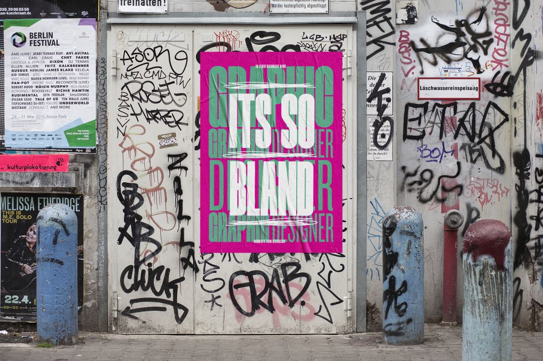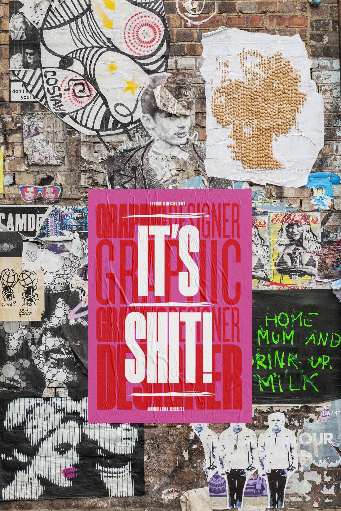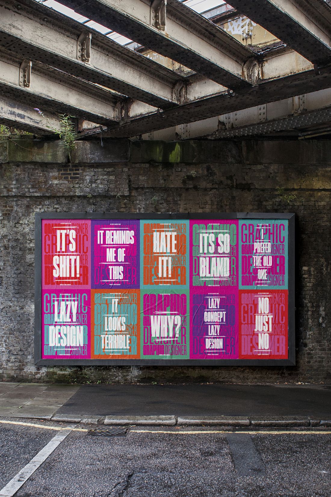
“If you have nothing nice to say, don’t say anything at all,” so said most of our grandmothers. And it’s what springs to mind with Nicholas Barclay’s latest project, Graphic Designers.
The Sydney-based designer, known for his minimal graphic artworks, has this time taken inspiration from a conversation he had on Twitter about the (sometimes) critical design industry: “I was chatting with a respected designer about how incredibly talented and really respected designers are having their work pulled to bits on the Internet by other designers and that’s when I thought the comments could make an interesting new poster series.”
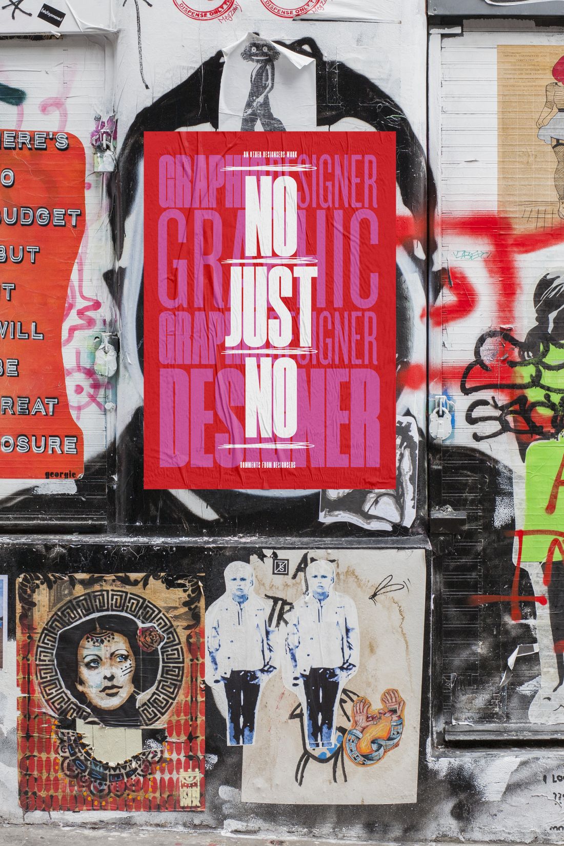
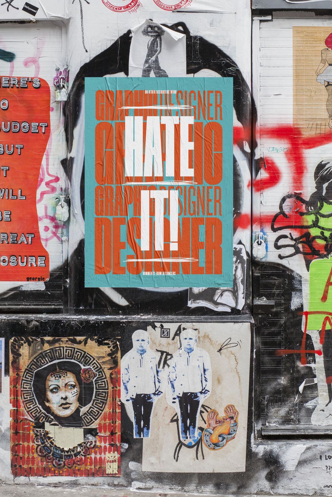
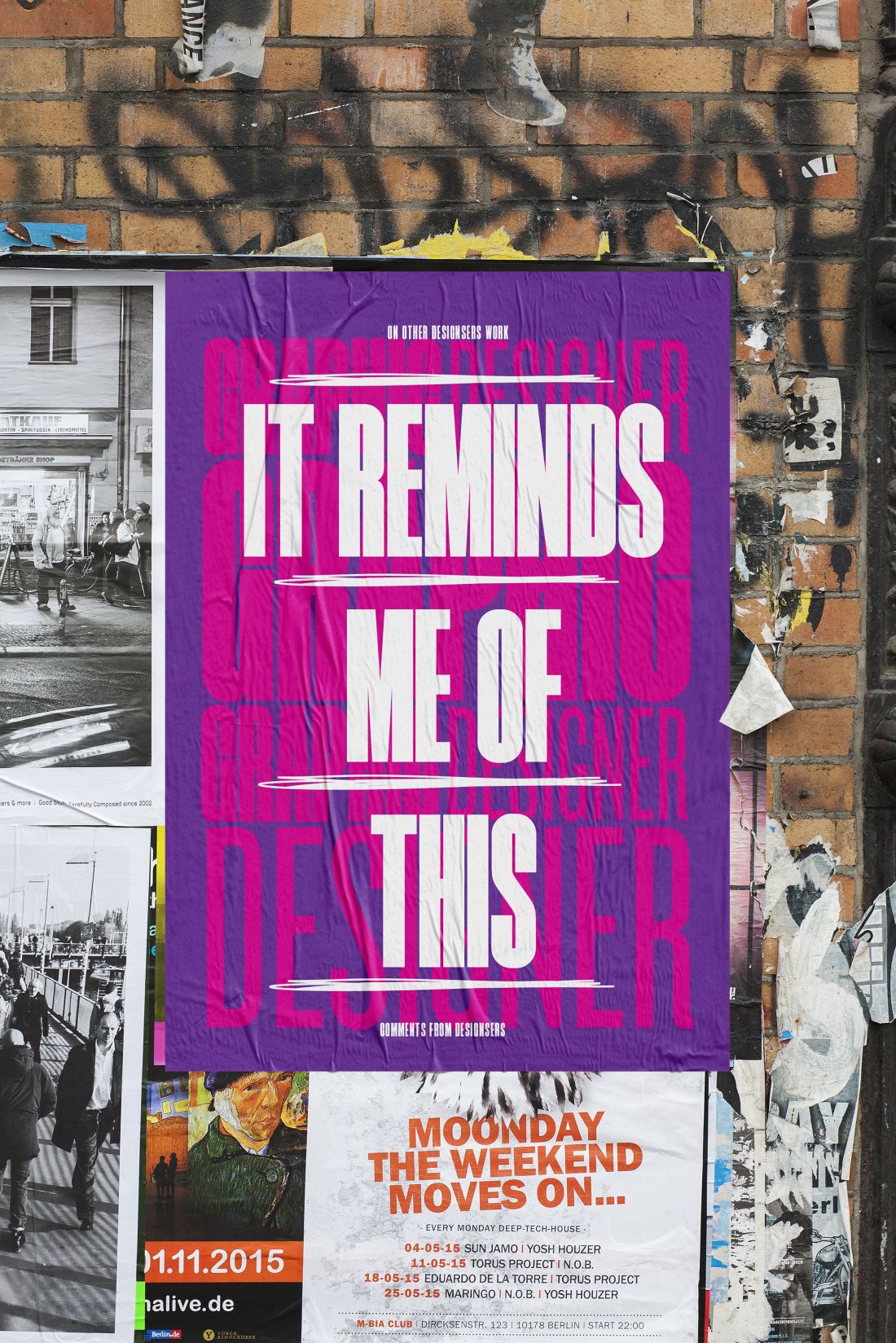
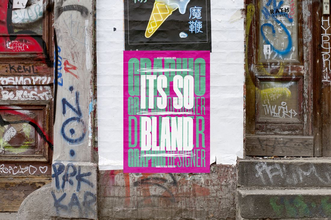
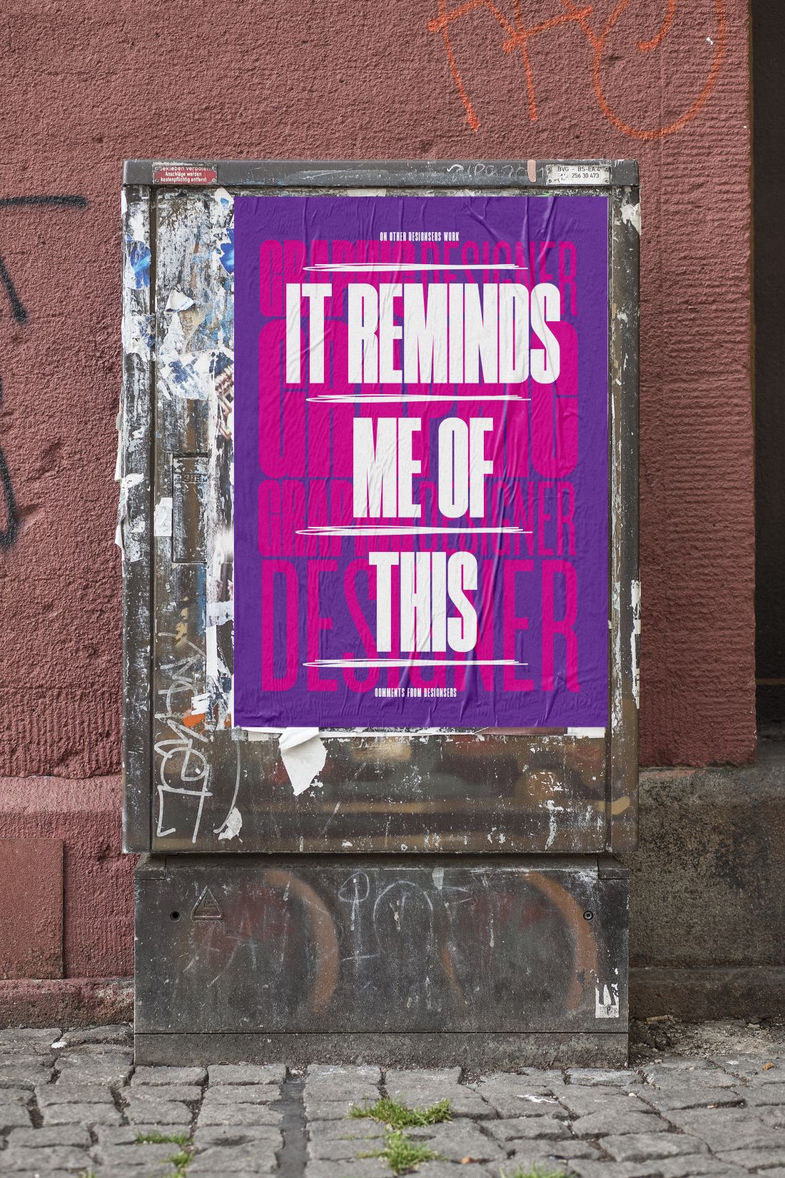
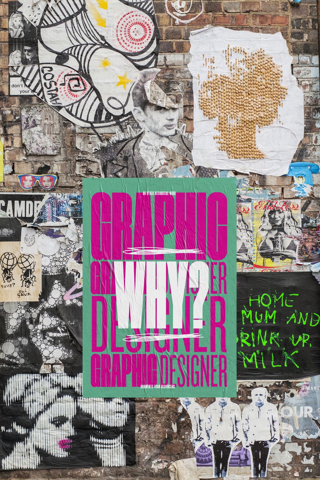
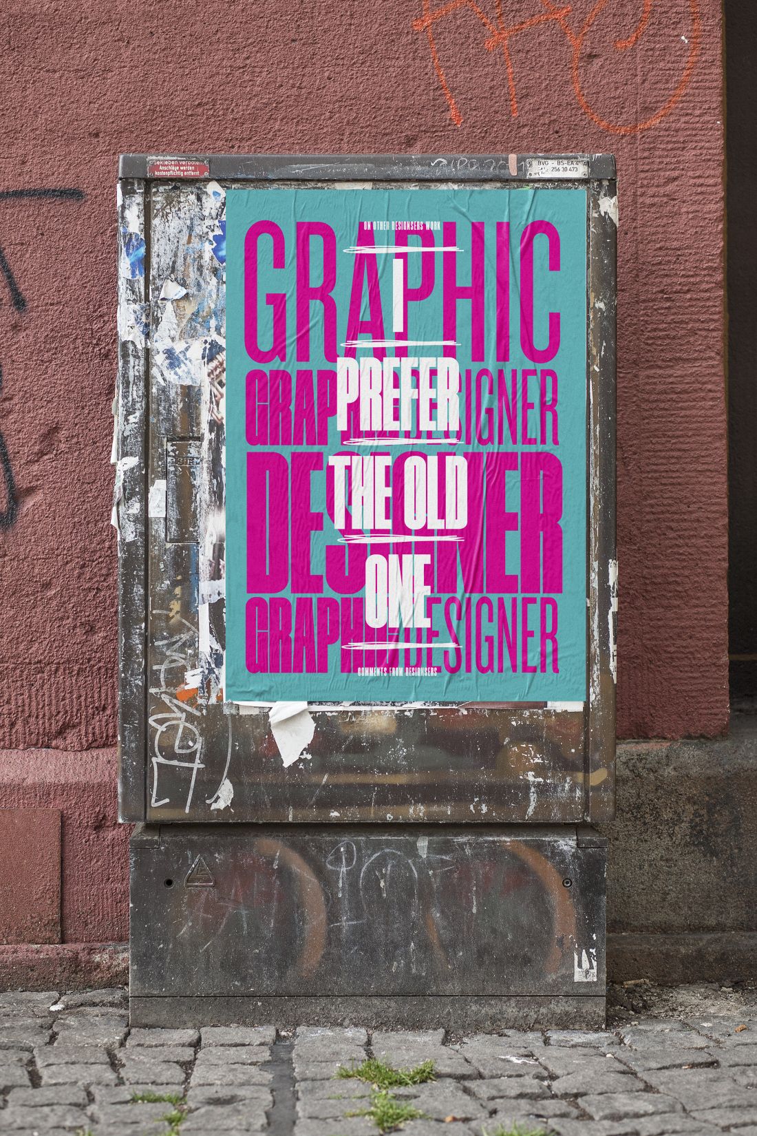
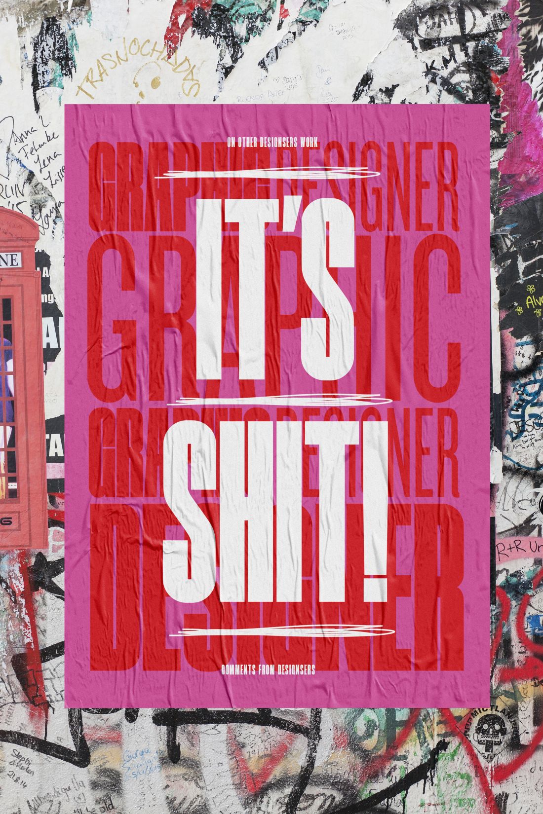
Barclay sifted through a number of websites to pick out a few critical comments, such as “I prefer the old one”, “No just no” and “It’s so bland” – and has presented them in bold white typography against a backdrop of different bright colours.
“It is so disappointing that people feel the need to write abuse and pull people’s work to bits rather than just not commenting or writing something constructive,” he adds, hoping that his new poster series will make people think twice before they hit ‘return’.
You can see more of Barclay’s work at nickbarclaydesigns.com.