Small businesses and startups have to compete in an increasingly noisy world, often against large, dominant businesses.
Customers who are just discovering your brand need something to remember you by, and your logo serves as a symbol of your business.
But not all logos are created alike. New design trends and fads in logo design appear every year.
Stripes, letter stacking, fades and geometric shapes were popular in logo design for 2017. Last year, monoline designs, negative space, and retro designs were all the rage.
But, which of these trends are worth following? And, which “trends” are really passing fads that will date your new logo in just a few years? After all, you want your logo to feel fresh and relevant for a long period of time, and not dated a year from now.
The truth is that not all logo trends are created equal. And, even if a trend does offer some inherent aesthetic value, if it doesn’t support and reflect your brand, it’s a poor choice for your logo.
A good logo design must reflect your brand, and be memorable, unique, and timeless.
You should avoid trends that get in the way of accomplishing those design goals.
As we wrote in The Small Business Guide to Creating a Perfect Logo:
At its most basic, a logo is a small, symbolic piece of artwork that represents a business. But, we’ve dug a bit deeper than that. When you set aside all the design trends and fancy fonts, at its core, a logo must:
1- Embody your brand.
2- Be instantly recognizable.
3- Be versatile.
4- Be timeless.
Everything else is optional.
In fact, I’ll go one step further. Every design choice in your logo should exist only to serve and strengthen the four items listed above. And, if you meet these four requirements, many other commonly cited logo must-haves, like simplicity and memorability, naturally follow.
Here are 6 logo design trends that we think will be hot in 2018 (plus 2 trends that you should avoid).
Creative typography
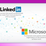
The visual mark of a logo is often supported by text. Some logos (including crowdspring’s logo) are made-up entirely of text – these are called lettermarks or wordmarks.
But not any old text will do. You can’t just plop your business name under your logo mark in Times New Roman or Comic Sans (shudder) and call it a day.
Your typography should be as tuned in to your brand as the rest of your logo. And, creative typography continues to grow as we head into 2018. Here are just a few examples…
Split Typography – These fonts feature unexpected negative space (or splits) in the letters while maintaining the text’s readability. There are endless variations to play with here between the choice of the base font and placement of the splits.
Chaotic Typography – This dynamic typography effect features chaotic, non-linear placement of the letters. If you have a playful or casually dynamic brand, this may be a good choice for you.
Hand-effect Typography – Rather than the perfectly smooth, polished, and fancy looping scripts of yesteryear, hand-effect typography looks like it’s been written by hand. These can range from cursive scripts to crisp prints to playful block letters. Irregularity is the key to this effect.
These typography styles are on-trend now. But, they’re only a fraction of the options available. So, don’t stop looking here.
Encourage your logo designer to play with typography to find the right fit for your brand.
Bright Colors
The internet has changed the way that we interact with the world. It’s vital that businesses design their visual brand with this medium in mind.
One of the strengths computers and mobile devices bring as a visual medium is their ability to display color. A computer or mobile screen provides a perfect canvas to show off bright, saturated colors. This is probably why we’re seeing such a big surge in brightly colored logo designs.
Intense colors that fade from a saturated hue to a lighter one, or gradients that segue from one shade to another continue to be popular in logo design.
So, don’t be afraid to play with different options. Just keep it simple enough that it won’t cost you a fortune when you actually have to print your logo.
And, don’t forget that colors tug on our grey matter to produce different emotional results. For more about using psychology to influence customers, check out our previous article “How 21 Brands Use Color to Influence Customers” to learn which colors will send the right message from your brand.
It’s a foregone conclusion that your customers will interact with your brand online. Make the most of this opportunity by capitalizing on the visual medium with eye-catching, vibrant colors that will set your logo apart from the competition.
Geometric Line Art logos
Geometric shapes eternally float in and out of favor in the worlds of architectural, fashion and graphic design. Geometric line logos are popular and look set to continue on an uptrend heading into 2018.
Geometric designs are loved for their clean, elegant lines and timelessness. Geometric design done well can be a thing of beauty.
However, a simple geometric line design is not the one-size-fits-all answer that some people seem to believe it is.
Logos must be distinct. This is what allows us to visually identify a specific brand from the vast array of logos in the marketplace.
And your logo must also reflect your brand. This is where blindly following this geometric logo trend can fall short for your business.
There are only a handful of basic geometric shapes – squares, circles, triangles, diamonds… Even once you branch out into octagons, hectagons, parallelograms and the like, there still just aren’t that many. So, designers get creative and begin to layer the shapes together, play with curves, introduce negative space…
But, the results often look like “just another geometric logo design” – indistinct, unremarkable, and communicating nothing about your brand.
If you choose to go with a geometric line logo, make sure your choice supports and reflects your brand identity.