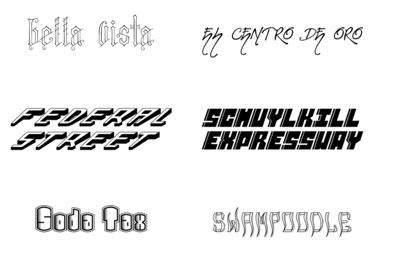
The graphic designers behind the set of fonts inspired by Philadelphia’s neighborhoods have returned – this time going beyond artistic interpretations of what Manayunk or Fairmount would look like as typefaces.
Ever wonder what a soda tax-inspired font looks like? It’s your lucky day.
Cliff Ross, the Philadelphia-area advertising agency, released its “contour collection” of fonts Tuesday. It includes six more typefaces. Among them are ones inspired by the “soda tax” and “Schuylkill Expressway.”
- MORE FROM PHILLYVOICE
- Feds announce more than 20 corruption, bribery charges against Philly D.A. Seth Williams
- Infrequently Asked Questions: What are the origins of the Philly rowhome?
- Ellen DeGeneres ‘shutting down a couple of blocks’ in Philly
“The ‘Soda Tax’ typeface was designed on a much lighter note,” the agency said in a news release. “It’s a quirky font inspired by the shape of a soda can. The typeface isn’t meant to be a statement for or against the issue at all. It was created solely in the spirit of fun.”
The new typefaces arrive a month after the seven-year-old agency debuted its “Philly Font” project that paid homage to 10 neighborhoods. Though, Cliff Ross got some flak for its “blight” North Philly font that resembled wooden boards nailed together, and it was later removed.
The agency also announced Tuesday it is taking input on themes for the next set of fonts in order to keep “with the true spirit of independence that was so paramount in Philadelphia’s founding.”
The poll will be open until April 21 and winners will be shown off in “The People’s Collection” this summer.
Tuesday’s fonts are available to download for a limited time.
Check them out below or visit their site and see all 15 fonts from Cliff Ross here.


