One of the most important UI elements in mobile app design is typography. Written text is the foundation of communication in all aspects of life, not just in mobile apps. Text messages are typically used for user interaction in mobile applications. Therefore, mobile apps typography forms the building blocks of mobile app design. It is a crucial component of the mobile UI. When used correctly, typography allows users to navigate the app smoothly.
Additionally, the application can be organized in a hierarchy thanks to typography. The order of importance in the context is determined by other UI elements like headings, subheadings, and body text created by mobile typography. Mobile typography also plays a crucial role in establishing brand awareness and conveying brand concepts to users in the first impression. An introduction to mobile app typography There are specific mobile typography rules in mobile app design, which ensure the app is easily understandable and provides a better user experience and user interface design. Typography is the process of figuring out the size, style, color, contrast, and layout of text styles in the context of designing mobile apps. Good typography for mobile UI design contributes to the app’s modern and clean appearance from an aesthetic standpoint. There are many resources to get inspiration when choosing a good font. Brands with operating systems such as Google and Apple offer free fonts. These resources offer plenty of serif typefaces and sans serif typefaces.
For instance, Apple has default fonts used in its apps. The serif font is New York, while the sans serif font is San Francisco. Additionally, there are a few font variants. These fonts can serve as a source of inspiration for font selection.
The importance of typography in mobile app design
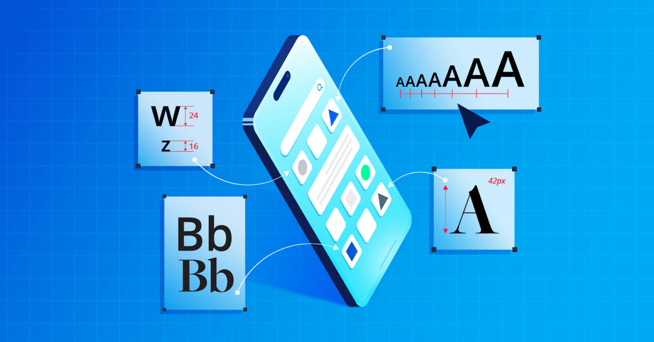
One of the first things to consider is the mobile screen size of mobile devices. When designing an app for the mobile world, it is important not to create an experience thinking of infinite mobile screens or wider screens like desktop screen. Since screens on mobile devies are smaller, presenting information can be more challenging and requires good user experience design. Therefore, choosing the right font size is important as it affects the space it will occupy on the mobile screen. To ensure the proper and effective use of mobile typography, designers or app design experts with years of experience in this field can be consulted.
Knowing the theoretical aspects of typography, such as letter spacing, line height, line length, kerning, etc., can be advantageous after selecting the appropriate typography. Typography is a distinct design and education field with numerous considerations. Mobile design can benefit significantly from a typographic specialty. Characteristics of Typography in App Copy In new-generation applications, especially in text-based applications, it can be observed that the device’s default settings work integrated with the application. In text-based applications, being able to adjust the font size within the app provides a good user experience and user interface.
In addition, in designs that will appeal to the general user, the operating system of the device used should be focused on. Mobile device manufacturers have typography recommendations based on the devices they produce and the software they use. The documents of Apple’s iOS and Google’s Android operating systems, which are the most well-known and standardized in the industry, are sources of inspiration when designing mobile apps. Thus, better mobile apps can be designed.
A minimum font size of at least 12 pixels is recommended for mobile app design because readability is important. However, it is not advisable to use this size throughout the entire design, as this size is only a minimum recommendation. Whenever possible, values lower than these should not be used. It should also be noted that the sizing units used in the two examples are different. iOS uses points while Android uses pixels.
If we give an example from iOS, when the system font is used, it is possible to use a font size of up to 11 points. However, based on the application, various values may also be utilized. Mobile typography skills can be improved by examining mobile apps.
How is the headline size determined based on hierarchy and balance?
The heading should be in harmony with the other design elements in mobile app design. The main factor to consider when determining the heading size is the body text size. The heading should be distinguishable from other texts in the design and easily scannable. When deciding on the size of the heading, there are a few important things to keep in mind: Hierarchy
Headlines help determine the importance level of content. Therefore, the headline size should be determined according to the importance level of the content. For example, main headlines are usually displayed in larger sizes and more prominently, while subheadlines are displayed in smaller sizes and less prominently. The least prominent is the body text under these headlines. Using font variants like regular, medium, bold, etc. can also help to highlight the text styles that need to stand out more clearly.
In some applications, it may be preferable to use a secondary font to differentiate headings and body text. Using different fonts can also establish a hierarchy. Design and purpose of the application If we take an example, in a news mobile app, displaying copy elements is emphasized, while in social media apps, visuals are more prominent. Therefore, it is smart to show headlines more prominently to users in applications where text is more important. However, this is not the case for applications for social media that include visual elements. Users focus on visuals rather than headlines.
Simple User Interface: Sometimes, it may be necessary to rely on design sense rather than rules for a clean and appealing look. Even if all the rules are followed, the design may not be eye-catching and clean for various reasons, including typography. This situation can be caused solely by the chosen font style. An initiative for an eye-catching design can be taken here on the basis of experience.
How to create contrast for color combinations and readability
According to the source, human psychology considers two close-together objects to be one. Therefore, the spacing used in writing is very important in creating contrast. The correct use of spacing, based on the most fundamental principle, is what separates which paragraph belongs to which heading and distinguishes headings from one another. The title and the corresponding paragraph should be kept close to each other. Another combination of title and body text that follows this group ought to stand out from the others. On the other hand, text colors also help create contrast. As a small but valuable tip, high saturation text colors in text-based applications will make readability difficult. In mobile design, using black and gray tones as text colors will provide a safety net. Additionally, a clear contrast will be created by selecting a headline color with darker tones than the text color.


