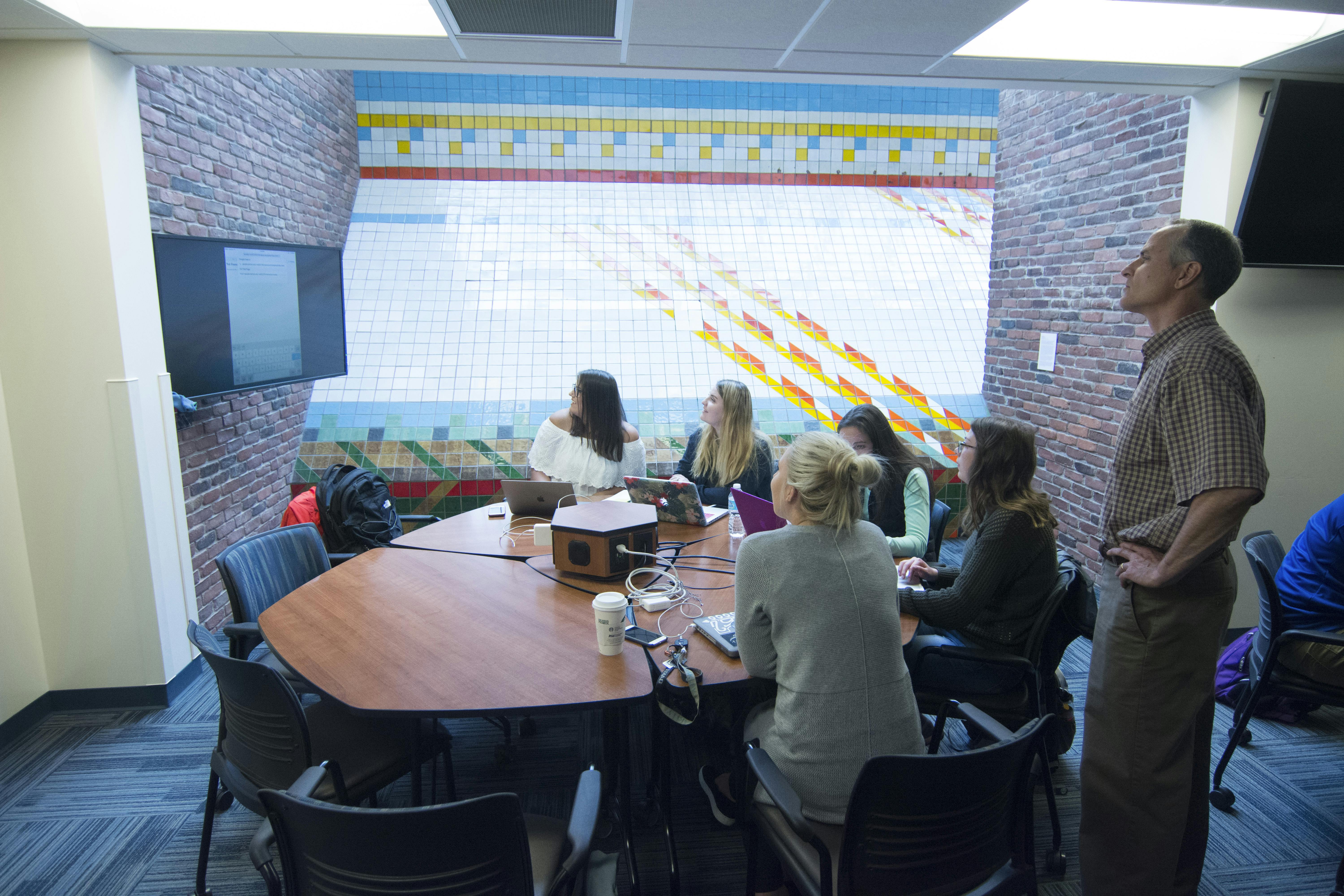
Lindsey McAlpin ’18 rests her head in her hands, frowning slightly as she stares at varying shades of gray on her pink MacBook Air. Only four days separate her from presenting her finished product—a fully functioning, professional website—to Nancy Brule, owner and operator of Marco’s Acres farm.
Before McAlpin—a business major from Andover, Minnesota—enrolled in Ripley Smith’s web design class, she had never so much as glanced at the back end of a website. She’d never studied HTML, the computer language used to build webpages, and she’d never dabbled in Bootstrap, a popular template application among web developers. Four months later, McAlpin can not only read and write basic code and navigate Bootstrap—she can build websites from scratch.
“These skills are seen as unique and helpful in any field of business,” says McAlpin, who hopes to work in marketing or advertising. “Even if I never code for my job in the future, I’m still really happy I learned these skills early on in life.”
Familiarizing students with changing technology is the goal for Smith, a professor of media communication who has taught web design at Bethel since 2008. With a perennial mix of journalism, art, communication, and business majors in the class, he tries to equip students with practical knowledge that will boost their resumes and even help them get a job.
Students spend four weeks learning the nuts and bolts of coding—gritty, tedious work that often spurs frustration and then satisfaction once students get the hang of it. Then Smith introduces Bootstrap, a front-end web framework that allows students to customize templates with their recently acquired coding skills. When they have a solid understanding of both, Smith says, it’s time to bring the discipline to life.
“Working with real clients raises the bar for the quality of their work,” Smith says. “Students do better when they see that their work has a purpose beyond the class.”
Their clients are often nonprofit organizations without a web presence or entrepreneurs who are just getting started. Sometimes clients belong to the Bethel community, like Brule and her husband Artie Terry—both professors in the communication department—who wanted a website for their small farming business.
“It’s a two-way street,” Smith says. “We get hands-on experience, and they get a free website.”
For the students, building the website can be a part-time job. Each group collectively spends 15–20 hours per week developing the site, referring to competitive analysis and reacting to client feedback. The work of website construction has grown increasingly complex—with HTML sliding out of the spotlight to make room for things like design and search engine optimization—and yet the placement of a single semicolon can still determine whether a page displays properly.
“Some students get super frustrated early on, but those that see it through develop an appreciation for the sophistication and complexity of the discipline,” Smith says. “Some of them end up seeing it as a potential career option.”
That’s true for Larkin De Haan ’17, an organizational communication major who landed a job as an executive team leader at Target. While web design isn’t a formal part of her role, several of her coworkers have asked her to help them design professional websites of their own, and after taking Smith’s class, De Haan feels equipped to do it.
“Gaining practical experience with a real client was an amazing component of the class,” says De Haan, who built a site for Community Stabilization Project, a nonprofit that promotes healthy relationships between landlords and tenants in St. Paul. “It was cool to know that we had an organization counting on us to create an effective and eye-catching new website for them.”
McAlpin and one of her group members, media production and relational communication major Arianna Johnson ’19, felt the weight of that responsibility as they mulled over last-minute decisions before their final presentation. Had they placed social media icons in the best location? Should they tweak the coding on the contact page? Was content distributed neatly?
Despite having given the Marco’s Acres site her best effort, Johnson was still a little nervous when she and her group stood up to present their website to Brule. She wondered whether their words, images, and design had captured the essence of the farm. But, as her classmates-turned-coworkers explained their decisions regarding everything from color scheme to site architecture, Johnson looked up to see that Brule’s eyes had filled with tears.
It was the only feedback she needed.
[Source:-bethel.]


