Whether it’s on our phones, in books, or on websites, we’re constantly digesting written words. Typography can be found everywhere, from storefronts to instructional booklets. We often reflect on the power of the written word, but rarely do we consider the designer’s role in emulating the tone of the word or sentence.
Behind the scenes, a designer has taken the time to consider the relationship between the look of the text and what the text says. In point of fact, the choice of type can easily convey a variety of moods, atmospheres, and even trends. However, what exactly is typography and why is it so important? In this article, we’ll lift the lid on everything you need to know about typography. We’ll start with the definition of typography, including a brief history of its origins.
We’ll then address the benefits of good typography and the impact it can have on your users. Finally, we’ll look into the different elements that comprise typography and what they all mean.
1. What is typography?
Let’s kick off with the basics: just what actually is typography?
Typography is the art of arranging letters and text in a way that makes the copy legible, clear, and visually appealing to the reader.
It involves font style, appearance, and structure, which aims to elicit certain emotions and convey specific messages. To put it succinctly, typography is what gives the text life. To understand typography in 2025, it’s necessary to take a quick look into its development:
A brief history of typography
Typography can be dated back to the 11th century, during the innovation of movable type. Before the digital age, typography was a specialized craft associated with books magazines, and eventually public works.
The first example of typography can be seen in the Gutenberg Bible, which kick-started a typography revolution in the west.
Fun fact: The style of type used in the Gutenberg Bible is now known as Textura, and you’ll find it in the font dropdown menu on major desktop applications today!
Fast forward to 2025, where typography is mostly associated with both the digital design world and print.
With the birth of the internet came a creative explosion of the art of typography. Suddenly, web designers had an abundance of fonts and type options at their disposal, making typography more visually diverse than ever before.
2. Why is typography important?
The design of a user interface relies heavily on typography, which encompasses more than just selecting appealing fonts. Good typography will establish a strong visual hierarchy, provide a graphic balance to the website, and set the product’s overall tone. Typography should guide and inform your users, optimize readability and accessibility, and ensure an excellent user experience.
Let’s take a deeper look at the significance of typography. Typography builds brand recognition
Not only will good typography enhance the website’s personality, but your users will subliminally begin to associate the typeface featured on your site with your brand.
Typography that is distinctive and consistent will help you grow your user base, build trust with them, and propel your brand forward. Decision-making is influenced by typography. Typography has a profound effect on the way that users digest and perceive the information conveyed by the text.
Eye-catching type is much more persuasive than weak fonts that don’t reinforce the message of the text.
The readers are drawn in by typography. Good typography could be the difference between someone staying on your website for one minute or half an hour.
It’s important that your website is visually stimulating and memorable, and typography plays a huge role in this process.
3. The different elements of typography
To get started in typography, you first need to get to grips with the eight essential typographical design elements.
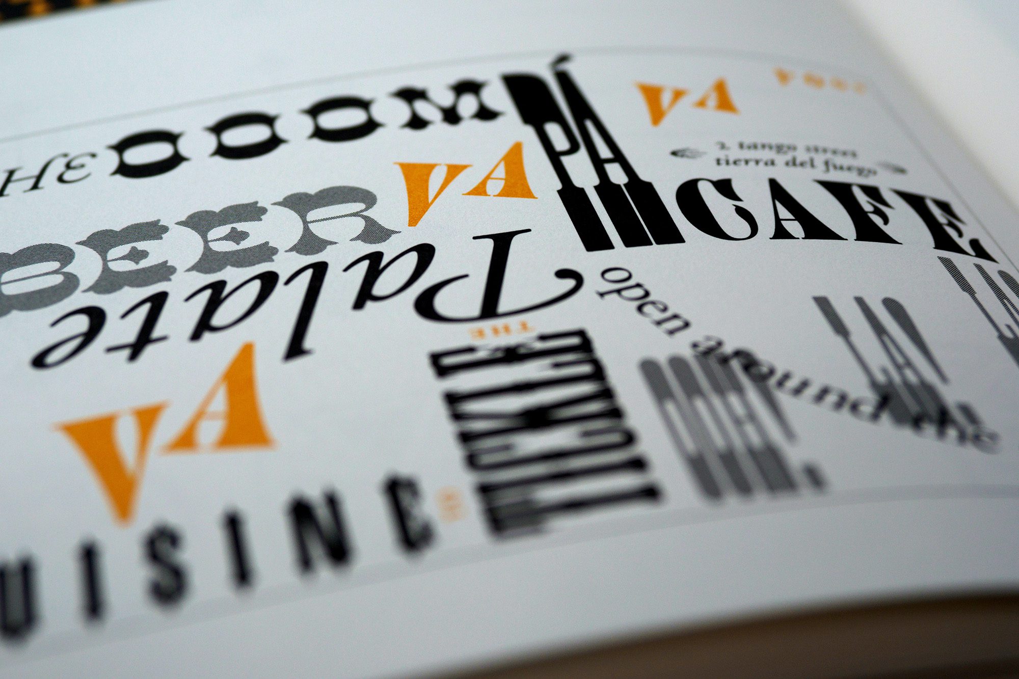
3.1. Fonts and typefaces
There’s some confusion surrounding the difference between typefaces and fonts, with many treating the two as synonymous.
While a font is a graphical representation of a text character, a typeface is a design style that contains a myriad of characters of varying sizes and weights. Put simply, a typeface is a family of related fonts, while fonts refer to the weights, widths, and styles that constitute a typeface.
Serif
The extra marks at the ends of letters distinguish serif typefaces, as the illustration above demonstrates. The addition of these small strokes and elements gives serif fonts an air of tradition, history, authority, and integrity.
It’s no surprise, then, that you’ll see this “classic” style used for newspaper titles, for example, or for the font used in books.
Times New Roman, the Microsoft Word original font, is a serif font. It was replaced in 2007 by the sans-serif Calibri.
Sans-serif
Just like the name suggests, sans-serif typefaces are defined by what they lack.
Without the serif’s more traditional strokes and dashes, the sans-serif font family is seen as much more modern and bold. As a result, it’s clear to read and, when used in headlines, grabs your attention more than serifs.
The CareerFoundry logo, for example, as well as the font used in this blog article, is sans-serif. When you start writing in a Google Doc, the default sans-serif fonts are Arial and Helvetica. Decorative
Again, given away by its name, the function of this typeface is aesthetic more than readable. As a result, you’re far more likely to see these used in brand names, logos, and short titles.
Walk around your local grocery or toy store, and you’ll see decorative fonts jumping out at you from every shelf. Just imagine trying to read an entire article written in them!
Decorative typefaces are excellent for allowing the user to show off even more personality, feeling, and uniqueness with their font choice.
Best UI practices for using fonts
It’s all well and good to know what is typography, but you also need to learn how to use it effectively in context. This is especially true for UI design. A good designer will never use more than three fonts, and they will keep the number of decorative fonts to a minimum, in order to keep the interface clean and simple. Most UI designers will pair serif fonts with sans-serif fonts, such as putting main body text in a serif font and putting your title in a sans-serif font, or vice-versa.
3.2 Contrast
Contrast, like hierarchy, helps readers understand which ideas or messages you want to emphasize. Spending some time on contrast makes your text interesting, meaningful, and attention-grabbing. Most designers create contrast by playing around with varying typefaces, colors, styles, and sizes to create impact and break up the page.
3.3 Consistency
Keeping your typefaces consistent is key to avoiding a confusing and messy interface.
When conveying information, it’s essential to stick to the same font style so your readers instantly understand what they’re reading and begin to notice a pattern.
While it’s okay to play around with levels of hierarchy to some extent, it’s good practice to establish a consistent hierarchy of typefaces (one consistent font for headers, another for subheadings) and stick to it.
3.4 Blank space Often referred to as “negative space,”
white space is the space around text or graphics.
It’s often overlooked and tends to go unnoticed by the user, but proper use of white space ensures the interface is uncluttered and the text is readable.
White space can even make the text stand out and make reading more pleasing to the eye. White space often takes the form of margins, padding, or just areas with no text or graphics.
3.5 Alignment
Alignment is the process of unifying and composing text, graphics, and images to ensure equal space, size, and distance between each element.
Many UI designers create margins to ensure that their logo, header, and body of the text are aligned with each other.
When aligning your user interface, it’s good practice to pay attention to industry standards. For example, aligning your text to the right will seem counterintuitive for readers who read left to right.
3.6 Color
Color is one of the most exciting elements of typography. Designers can really get creative here and take the interface to new heights. Text color, however, is not to be taken lightly: nailing your font color can make the text stand out and convey the tone of the message—but getting it wrong can result in a messy interface and text that clashes with the site colors.
Color has three key components: value, hue, and saturation.
A skilled designer will be able to strike a balance between these three elements to ensure that the text is legible even for people with visual impairments. Often, designers will test this by viewing the text in greyscale (without color) and making tweaks if the text is too dark or too light against the background color.
If you’d like to learn more about applying this effectively in design, check out our full guide to color theory.
3.7 Structure Establishing a hierarchy is one of the most vital principles of typography.
Typographical hierarchy aims to distinguish between prominent pieces of copy that should be noticed and read first and standard text copy.
Designers are urged to create typefaces that enable users to consume the necessary information in a short amount of time in this age of short attention spans brought on by social media. Hierarchy can be created using sizing, color, contrast, and alignment.
For instance, if you start a line of copy with a red exclamation mark icon that is larger than the previous line, this gives readers a visual indication that it is a call to action. The most typical example of a typographical hierarchy is size: headings should always be larger than subheadings and standard text.