Consider the book cover: that eye-catching portal into fantastical stories, brutally honest memoirs, and art books brimming with hyper-detailed images of masterpieces.
At their best, covers offer an enticing teaser for what’s to come on a book’s pages, or convey the essence of a story in question. It’s not an easy task, as any book designer will tell you. But it’s certainly a rewarding one.
Below, we talk with five designers whose book jackets are routinely hailed as crowd favorites. Their designs blanket young adult bestsellers like John Green’s Turtles All the Way Down (2017), literary classics like Vladimir Nabokov’s The Eye (1930), and tomes that rethink the form of a book (one comes with a remote control, and drives like a toy car).
Below, they reveal what inspires their designs, how they navigate working with authors and publishing houses, and what happens when they try to communicate everything about a book on its cover (teaser: it doesn’t work).
Before moving to New York City for college, Willey worked in bookstores around her native Southern California for almost seven years. There, she fed her love of novels and nonfiction and developed a new interest in their covers. After an unsatisfying stint in journalism school, she had an epiphany: “That I could still be involved in the creation of a book, but in a more visual way than I had imagined before.” Not long after, Willey began to design striking book jackets—and has continued to ever since.
The Brooklyn-based designer excels at conveying the spirit of a given book through the inventive use of typography. For New People (2017), Willey rendered the novel’s title and its author’s name, Danzy Senna, in bold, off-kilter text that hints at its biracial heroine’s bold personality, as well as her personal struggles and feelings of displacement. On the cover of Priestdaddy(2017), Willey turned the memoir’s provocative title into a gold cursive nameplate necklace that rests on a backdrop of bare, freckled skin. The design alludes to themes of youth, belief, and maturation explored—with no small amount of humor—in writer Patricia Lockwood’s text.
While Willey’s love of books no doubt informs her inspired cover designs, she also admits that this passion can complicate her job. “The most challenging aspect for me is when I love a book and become too close to it,” she confessed. “It’s easy to get hung up on communicating everything you want to about a book, which is pretty much impossible.” Despite this hurdle, Willey can’t help falling for the stories she designs.
“I love books and I think it’s a pretty incredible feat in itself to write one,” she mused. “The most rewarding aspect of designing them for me is that I get to play a tiny part in a process that I find so remarkable.”
Rodrigo Corral
New York-based Corral has designed a staggering number of the most iconic covers to grace bookshelves over the past 10 years: Jeffrey Eugenides’s The Marriage Plot (2011), Junot Diaz’s The Brief Wondrous Life of Oscar Wao(2007), and Jay-Z’s Decoded (2010), to name just a few. Often, they fuse bold typography with an image that operates like a logo or spirit animal for the volume it emblazons.
Corral has been working in the publishing industry for two decades, and these days wears many hats: He not only runs his own studio, but also works as the creative director for mega-publisher Farrar, Straus and Giroux. Though he doesn’t only design books, they have become his speciality—and his passion. Corral noted that the most rewarding aspect of his job is “the opportunity to read stories that are about today and also not of this world, and then explore how best to translate them into an image or images.”
The Long Island-raised designer, whose studio is nestled in Manhattan’s financial district and covered with paraphernalia from another personal passion (basketball), has long been attracted to the collaborative nature of book design. A designer like Corral works with not just the author, but also art directors, agents, publishers, and marketing teams to come up with a single cover that captures the thousands of words that comprise a given publication.
Corral’s favorite projects are those in which “we each play a role, but I’m given the freedom to push past the expected,” he said. Indeed, the designer has made a point to continually evolve his aesthetic, and not become trapped in trends.
The covers that result bring together bold typefaces with unorthodox design choices that are nothing short of tantalizing—visual teasers that make readers want to dive into each book to learn more. A 2017 cover for Jeff VanderMeer’s post-apocalyptic fantasy Borne, for instance, pairs a slowly liquefying, neon-hued bird of paradise with a futuristic sans-serif font. Fellow cover designer Alison Forner called it “the most stare-worthy jacket of the year,” one that makes her want to “get lost in the ‘O’ of ‘Borne,’ and inhabit the world this alien plant sprouted from!”
Stefan Sagmeister

Sagmeister approaches book design like he does all of his projects: irreverently. He’s fashioned tomes that readers can drive like remote control cars or even eat off of (thanks to a plastic cover that doubles as a dinner plate). Others are perforated with holes, or coated in three-dimensional extrusions.
It’s safe to say that the publications coming out of Sagmeister & Walsh, Sagmeister’s New York-based creative agency, are anything but typical. But ask the boundary-pushing Austrian designer what drives these projects, and his answer is surprisingly straightforward: “It’s pretty simple: I like books,” he demurred. “It is engaging to design things one likes.”
Sagmeister’s firm prefers to design every page of the books they take on. That said, their covers have become especially iconic, harnessing the essence of each publication with both conceptual rigor and panache.
Take, for example, a 2011 monograph filled with artist Ashley Bickerton’s work. The cover features a photo of Bickerton’s head, painted green, overlaid with colorful custom type. Both elements reflect Bickerton’s paintings: trippy canvases that incorporate doctored self-portraits and allusions to island life. (A limited edition slip-cover, fashioned in teak and mother of pearl, could also be purchased with the volume; together, they went for a cool £2,500.)
Other projects include a book for BMW that came equipped with hidden wheels and a remote control, and the 2011 yearbook of Columbia’s Graduate Architecture School, which had a cover that cheekily featured an image of a potato, “perhaps a fair symbol of the cultivation of ideas and creative solutions,” the Sagmeister & Walsh website states. The entire book was punctured with three massive holes, meant to “connect these ideas with each other.”
While Sagmeister admits that working on books can be “hourly and work intensive”—often requiring the organization of dozens of texts and hundreds of images—they remain a thrilling challenge. Next up, Sagmeister & Walsh is designing a tome about beauty. “We’ll try to make it beautiful,” Sagmeister quipped of the process. Given his track record, it surely will be.
Janet Hansen
Hansen’s jacket designs are both economical and deeply affecting—like a great poem. It’s no wonder, then, that she’s concocted some of her most spellbinding covers for books of poetry. The New Jersey-based designer, who works for Penguin Books, produced two in 2017, each crowd favorites amongst her peers. For both, she joined solitary, graphic illustrations with elegant typography.
On the cover of Russian poet Vera Pavlova’s Album for the Young (and Old)(2017), Hansen placed a drawing of a human silhouette, created by the author’s child, at its center. She encircled the little pink figure with the book’s title and Pavlova’s name, rendering the the text in a playful, handmade cursive that mirrors the spontaneous quality of the sketch.
The jacket for Anne Michaels’s All We Saw (2017) is equally thoughtful. Hansen illustrated the book of poems about existential quandaries with an image of a hand that holds a star-covered night sky. “As a result, we understand that this book of poems will tell the story of a universal human experience,” her peers at Strick&Williams have noted.
Hansen doesn’t shy away from books that deal in big, sensitive, or painful themes. “I love that my job is to create a visual for stories and ideas that are bigger than me,” she explained. In a cover for Anuk Arudpragasam’s The Story of a Brief Marriage (2016), for instance, two spindly, intersecting lines represent the fragility of the marriage explored in the book—one inspired then broken by the Sri Lankan Civil War.
These days, Hansen is in the process of designing covers for books about “complicity and rape, opioid addiction and war, love and culture shock, and violence and oppression,” she said. “All powerfully urgent stories and ideas that I am grateful to be a part of.”
John Gall

Design by John Gall.
Design by John Gall.
New Jersey-based Gall’s first paying job was as a sign painter, making placards for a grocery store. Later, he landed his first design job, working for a mass-market book publisher. Both roles required him to make work within very specific parameters: the space of a commercial sign, on one hand, and that of a book cover, on the other.
Since then, Gall has designed countless book jackets, from those blanketing classics penned by Vladimir Nabokov, to all of Haruki Murakami’s novels, to the latest best-sellers like Jennifer Egan’s Manhattan Beach (2017). For Gall, the limitations that book design presents—like crafting a compelling image within a six-by-nine-inch rectangle—are appealing. “Since the format is so structured and limited, anytime you can do something ‘new’ is a special victory,” he explained.
The designs Gall has produced over the course of his lengthy career are eclectic and routinely touted as inventive and smart. In 2012, one editor called Gall’s cover for Michel Houellebecq’s The Map and the Territory “so different from anything else that it begs to be studied closely and then taken home” and one that “strides boldly into the realm of fine art.” At its center is a captivating, if confounding, photo collage, in which a hand and half of a face meld into one. The image levitates behind the book’s title and against a snowy backdrop.
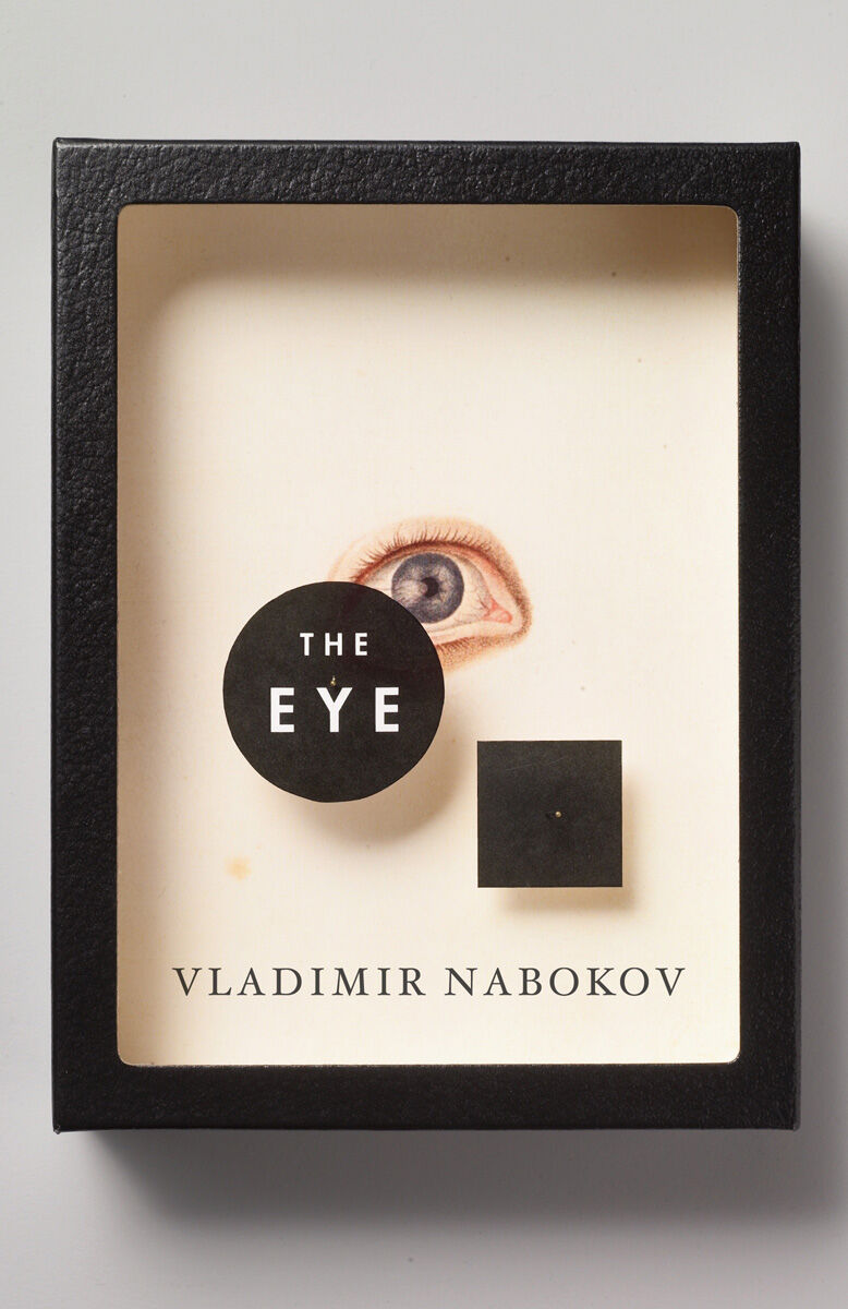
Many of Gall’s most riveting covers layer found, vintage images inspired by his passion for collage. A redesigned cover for Nabokov’s The Eye (1930), for instance, resembles the kind of box that holds taxidermied insects: The title of the book looks as if it’s pinned atop an illustration of an eye. The concept was sparked by Gall’s knowledge that Nabokov was not only a writer, but a butterfly collector, too.
Since 2012, Gall has been the creative director for Abrams Books, where he recently shepherded his fellow cover designer Paul Sahre’s memoir, Two-Dimensional Man (2017), into being. Among many other projects, he is currently editing and designing a book about ink-making (“Yes! You can make your own ink!” he quipped), as well as piecing together a publication featuring his own collages, many of which hint at the process and motivation behind Gall’s best cover designs.