Is it possible to live in a world without typography in graphic design? If you really think about it, typography is an important part of what we do every day. Typography has influenced or been influenced by every string of letters printed in public places, historical artifacts, and important places. Designing graphics is no different. You will be able to communicate with your audience more effectively through the typography and strategy of your graphic design. You can also give your work personality and emotion if you use the right typeface. In this article, we’ll cover some best practices for using typography effectively. We’ll also give you advice on how to add your own personal touch to your designs.
7 Characteristics of Typography
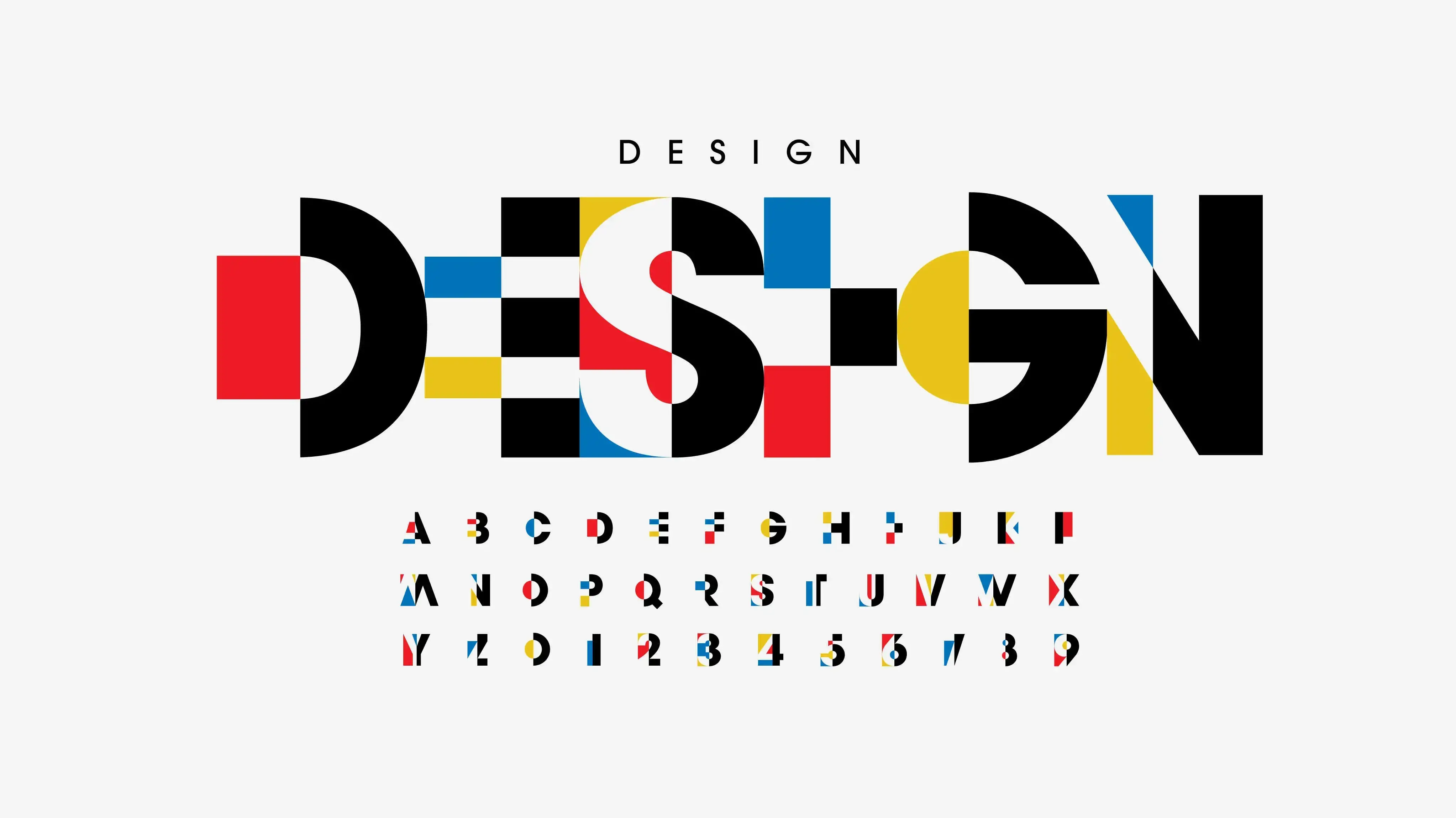
Typeface, alignment, color, contrast, consistency, white space, and hierarchy are the seven fundamental aspects of typography.
Typeface
A typeface is a design style that comprises a myriad of characters of varying sizes and weights. To put it another way, a typeface is a family of related fonts, while a typeface’s weights, widths, and styles are called fonts. They are different from fonts, which are a graphical representation of text characters.
Alignment
Through alignment, text, graphics, and images are combined and put together to ensure that each piece has the same amount of space, size, and distance between them. If your text is aligned to the right, for instance, readers who read from left to right will find it confusing. Many UI designers use margins to make sure that their header, logo, and text body are all aligned with one another. When coordinating your user interface, it’s wise to take into account industry standards.
Color
Value, hue, and saturation are the three main components of color. A skilled designer will be able to strike a balance between these three aspects to produce writing that is appealing and simple to read, even for people who have visual impairments. Designers frequently check this by examining the text in greyscale (without color) and making adjustments if the text contrasts with the backdrop color too darkly or too brightly.
Contrast
Contrast helps you tell your audience which ideas or points you want to emphasize. Most designers use contrast to make a statement and break up a page by experimenting with different fonts, colors, styles, and sizes.
Consistency
Looking at this picture, you can see why it’s crucial to use the same font type throughout an informational piece—so that your audience can quickly grasp what you’re saying and start to spot patterns. A cluttered and confusing interface may be prevented by maintaining consistency throughout your fonts.
While experimenting with different levels of hierarchy is acceptable to some extent, it’s best practice to develop and adhere to a consistent hierarchy of fonts.
Blank space The term “whitespace” refers to the empty space that surrounds text or other objects. Whitespace can take the form of padding, margins, or just a clear space. It produces a beautiful aesthetic environment and may even make words more noticeable. Because it is pressed up against the border of the first box, it is difficult to read the text there. The text has more room and the design even appears more fashionable in the second box.
Hierarchy
And last is hierarchy. Typographic hierarchy seeks to provide a significant separation between important textual elements that should be noticed and read first and ordinary textual elements. In this day and age of short attention spans brought on by social media, designers are urged to produce typefaces that allow users to consume the necessary information in a short amount of time.
Important role in design
Because visuals are used to convey messages, typography plays a significant role in design. Strong emotions are evoked, information is conveyed, and the content being presented is given meaning through the use of visual language. With the right combination of typefaces and fonts, you can make your content look clean and professional.
Using typography
Your design’s mood and personality can be influenced by the typeface you choose. For example, certain typefaces are more casual, while others are meant to convey sophistication. The overall perception of your design by your audience will be influenced by the typeface you choose. For instance, Paul Renner created Futura in 1927 as a modernist sans-serif letter form, making it one of the most influential sans-serifs ever created (it has been used on everything from album covers for rock bands like Nirvana’s Nevermind to Apple logos). It has a very distinct geometric style that makes me think of “modern” when I look at it. As a result, if I were creating something new today (like an app) that needs to look fresh and new in comparison to its competitors while still maintaining some elements from traditional designs, such as fonts that were available back then (think typewriters), then perhaps Futura would be appropriate! Also, typography can also be used to add personality to a project. You might want the text to speak in the author’s voice if you’re writing an editorial piece. This can be accomplished by employing a variety of fonts, weights, sizes, and styles throughout your work. effects on communication Use typography to support, reinforce, and highlight the message of a project. Apart from that, you can also add emotion to a project by making careful design choices.