Accessories are the antidote to a sea of sameness at furniture retail.
They have the capacity to provide personality to retail furniture store environments, yet are often treated as an afterthought. That’s why Furniture World interviewed experts in the accessory field to get ideas about how stores can do a better job of buying, merchandising, selling and profiting from accessory items.
The Big Opportunity
Furniture World asked David Gebhart, CEO of Global Views, the manufacturer of home accessories and furniture to comment on how most furniture stores view the category. “One thing I can tell you,” he says, “is that some furniture stores tend to view accessories as a painful necessity. But once they commit to having accessories programs, they are surprised by the amount of volume they can do. Likewise, commissioned furniture sales people underestimate the value of focusing on accessories in furniture store environments. They may focus on selling a big dining room without mentioning the vase or candlestick that’s sitting on it.”
Sharon Davis agrees about the value of accessories to furniture retailers. She is the Executive Director of Accessories Resource Team, the decorative accent and accent furniture industry association, better known as ART. The association co-produces the ARTS Awards with the Dallas Market Center, holds its own annual ART Conference, and produces programming and events. “Accessories can be a huge profit center for any furniture store,” she says. “Those that do it right see a high return on investment from the home accent side.”
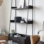
One of the best and most obvious attributes of adding accessories is they do not take up floor space.
Global Views’ David Gebhart recalls, “I grew up at the Bombay Company, and when I first went to work there in 1988, they weren’t big in the accessory business. At that time they sold mahogany furniture and displayed a few things on the walls. And the discussion I had with Bombay’s CEO at that time was, ‘We’re only talking about investing money in accessory items to make our furniture look better, and it will increase our sales volume without taking up any additional floor space.’ If it hangs from the ceiling, if it sits on a surface, it’s totally free real estate.”
Why Do So Many Furniture Retailers Under-perform?
Paul Thompson, a consultant who does space planning, product development and merchandising in the gift and home furnishings industries, tells us that there are two major reasons why furniture retailers do a poor job with accessories. The first is that, “they often don’t have the extra dollars to buy accessories like they should, and don’t purchase them deep enough.” The second reason is that they may not have the expertise to buy, and display them well. “Buyers,” he notes, “do not necessarily know how to style a room.” They may know the costs, the turns and the margins on categories and individual pieces, but not always the best way to finish that room out, which is important for making money with accessories. “Lots of retailers don’t know how to handle accessories. For example, they place lamps all over the store, and sometimes it’s hard for shoppers to make a purchase decision because they’re not also in a collected area.” More advice from Paul Thompson on merchandising accessories will be presented in the July/August issue of Furniture World.
“Stores that are under accessorized are just not putting their best foot forward with the tools we have to work with today,” adds Jason Phillips, Vice President of The Phillips Collection, Founder/President of Jason Phillips Design, and current President of the American Society of Furniture Designers (ASFD). “Many stores, especially single store retailers and small to medium sized chains need to be a little more confident in their buying position and in their store aesthetic.
“Larger retailers such as Pier One, are in a different position. For them it’s just a question of hitting the right trend mixes with the right marketing tools and the right consumer outreach to get sales. I admire West Elm which has it’s own amazing design nucleus. They’re one of the hottest for me right now along with Restoration Hardware and some other major players.”
Seth King, Surya’s Vice President Sales adds, “Accessories bring a huge amount of value to the look of a store. Much of the problem, for some retailer owners is to figure out how they get from where they are, to where they need to be. It’s tough to go directly from lining up sofas in the store to achieving a Pottery Barn look overnight, but there are some logical steps they can make along the way, and the first and most important of these is that ownership needs to be behind the effort, push it.”
This article will circle back to describing more detailed tools to bring a lagging accessory program from where it is, to where it needs to be, but first lets take a look at design and color trends.
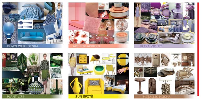 COLOR TRENDS from Carpenter + Company’s Trendscape Color + Trend Spring/Summer 2016 report. Dusty Denim Blu: Tones of dusty, denim blues combine to offer up a chambray chic and comfortable mid tone color. A slight tinge towards turquoise takes it to a new hue. Simple textiles, forms and patterns work best. We like that faded, washed and crumpled aesthetic. Ape for Apricot: Beautiful blushes offer us a feminine focus that range from a warm, red-cast to a slightly sharper pink-cast and these warm the palette. Apricot works nicely with taupe and warm greige, but is just right with clean white. Ultra Violet: Purples seep into subtlety with this color. Sitting in the midst of the range with a slightly blue or pink cast, it leaves us feeling as though we just got whiff of a berry sweet. Utilizing it with other tonals and deep dark pinotage add sophisticated flair. Plant Life Green: Jungle plant life is lush, fresh and engaging. Leafy, foliage greens inspire the depth of this seasons’ potent plant life green. Just as in nature, sitting fairly central on the color spectrum, it plays well with all the other greens in the palette, especially the herbal and citrus ones. Sun Spot Yellow: Sour and potent, this lemony yellow reminds us of the power of solar energy. Pair it with black and white or sharp leafy greens to make this color look fresh and fruity and engage us with that sharp citrusy quality. Metallic Mocha: The influence of the new browns and taupe on the palette has reached the range of metallic. Copper becomes a molten mocha bronze. Textures allow for the play of light along interesting surfaces. Organic forms add interest. |
The Trends
Patti Carpenter, President and Creative Director for Carpenter + Company suggests that, “Conservative retailers who won’t take giant leaps forward in terms of what they’re willing to do with, say, upholstery color, can look at patterns, simple geometrics or subtle colors to give classic furniture a lift.” Carpenter works with home decor clients doing development with a focus on color, print pattern, surface design and materials. She also does private label product development for clients pairing them to artisan producers to develop exclusive handmade products. Illustrating this and the second installment in this article series are images she’s composed that reflect upcoming trends for 2016.
We asked Carpenter to review what’s trending, and make suggestions about how to improve retail displays.
“Accessories,” she suggests, “are where retailers can play with color. It’s easy to bring in colors with pillows, throws, and other accent textiles, also vessels, vases and similar items. That’s how to add a dash of inspiration. They should also play with patterns.”
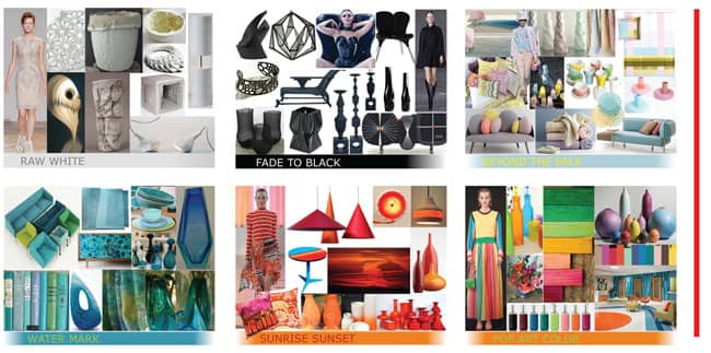 COLOR TRENDS & PALATTES from Carpenter + Company’s Trendscape Color + Trend Spring/Summer 2016 report. Raw White: Rough and raw, highly tactile finishes and textures inspired directly from the wilds of nature are where white will win this season. From molecular and skeletal structures to wintry birch and raw and vegetable-inspired ceramics. Fade to Black: Bold, and anything but basic, black is back in full force. Forms are geometric, very graphic and almost otherworldly. We see both matte and shine finishes showing that black too can play with light. COLOR PALATTES Watermark: Calming and restful watery turqs and blues are tinged with sharp algae greens this season. They offer up a combination that is vital and simultaneously soothing. Patterning that recalls the dance of light on water is alluring and calls us into the surf. Sunrise Sunset: A heated palette of warm sun drenched reds, deepened with a touch of blue to add interest. Pair them with shades of russets and burnt oranges. Look to the skies at days’ end for inspiration and pause to admire the splendor. Pop Art Brights: Quirky bold color that is just a bit off-kilter. Complex and dynamic, this palette recalls a retro feeling of the late 60’s and 70’s pop art scene. Bold blocks of color and patterned patchwork enliven rooms and retro robes on the runway. |
The Runway and Home Fashion Trending Together
Looking at the marketplace, the trends and combinations may seem to be all over the place. Carpenter’s most current Trendscape Color + Trend Spring/Summer 2016 report (copyright 2015, all rights reserved) names trends that range from 70’s psychedelic, to butterfly wings, to pale, feminine tones. Carpenter says, “you wouldn’t necessarily see these trends on the floor now,” but in 2016 you’re going to see this level of blues start to emerge. You’re going to see powdery kinds of colors. You’re going to see lavenders. That’s what we’re tracking. We work, anywhere from 18 months to two-and-a-half years out, but you will start to see them at trade shows.
“Right now, there’s a beauty in what’s going on with home fashion,” she explains. “There used to be a lag time between what happened on the runway and in the home. Both are impacted at this stage simultaneously by the trends. Now they are closely related, and are being impacted by many of the same social and cultural influences.
“There are many ways that retailers can interpret the trends for their customers. There are many to draw from right now, dictated by a retailer’s own sense of style, and who their customer is. The reason we publish the Palette is to illustrate how retailers can put colors together. Even though it may seem at first glance like the trends are all over the place, they are actually quite specific. For example, we are seeing changes in the level of saturation of color.
“There’s a pale palette we’ve been talking about for a few seasons. Colors that might have shown up in Spring-Summer seasons are now being used all year long. We are seeing powdered interpretations moving forward as well, where before we saw them as rather oily. So,the trends are not all about the color, they are also about the finish, whether it’s a dense, flat, matte textile color or a shiny, reflective silk or satin.”
Commenting on why many stores struggle to incorporate color in displays, she continues, “It depends on the type of store you’re looking at. There’s a big surge in color, happening in home furnishings in items such as accent pillows and throws.
“There’s also a lot of color happening in accent chairs, it’s huge. We’re seeing beautiful new shapes coming through in furniture, and I’m talking about from the very high end all the way down. This past weekend, I visited Room and Board and Pottery Barn. The weekend before it was Design within Reach, Restoration Hardware and Crate and Barrel. In certain channels of distribution we are definitely seeing color coming through. In Ethan Allen I was amazed to see some really great patterns on side chairs and dining chairs, for example.”
Pattern trends that stand out for this season include, “a lot of repeat patterns. Those can be geometric or organic forms that just repeat and repeat and repeat, one behind the other or layered together. I’ve also seen, big water-colored blossoms. In terms of the newest florals, we’re see ing daisies replacing lots of the roses that have been out there for a while. Tropical prints are coming on strong including big palm fronds in all kinds of ways plus flamingos and palm trees, even a Gauguin kind of look. We’re seeing motifs that incorporate vine patterns. It’s much more botanical. There are different ways florals are being used, including what I called an ‘Asian Persuasion’. It’s a trend we will see moving forward, ranging from Asian brocade to cherry blossoms to the blue and white Delph kind of coloring seen in vintage and antique Chinese porcelains. Also Japanese Anime patterns and koi fish. Butterfly patterns have come back around as well.
Something furniture retailers might do, she suggests is, “to talk about textiles. There’s a lot happening in accent textiles with texture, prints and patterns. So where, a few seasons ago the trend was to have maybe three or four solid color pillows on a sofa, now at least one or two of them will have a pattern. Becoming comfortable with mixing and matching color and pattern is something that’s a useful skill to have at retail.
“Also knowing how to use texture is important, and having a sense of how texture can add a visual impact to what’s happening on a piece of furniture.”
Fashion forward retailers are increasingly using accent furniture as well as smaller accessory items to add a pop of color and interest. Carpenter observes, “In furniture we’ve gone from ornate silhouettes to simpler forms, with the popularity of mid-century modern and also styles that are square, tight, solid and almost stark. And then there’s another direction that’s coming. I’m seeing many more rounded backs on sofas and chairs. Rounded arms, not in a camelback sort of way, but more contemporary, clean and sleek. Those kinds of styles are interesting to mix and match in with more traditional pieces to give a bit of a refresh. I’m noticing the legs on furniture beginning to splay outward, and that’s something we will talk about in our Fall ‘17 report. The whole idea of this splayed leg, adds another visual line. It’s interesting because legs have previously been very straight, very square.”
David Gebhart of Global Views agrees with Patti Carpenter that accent furniture can help to make retail displays stand out. “Retailers should really be looking for something to differentiate them from their competitors,” he says. “And, they can do that by finding the perfect accent table to put in a brown wood environment. Maybe made of metal, or stone, or another material. When I talk about accessories, I talk about accent tables as accessories as well. ‘Wow’ furniture pieces mixed in with ordinary furniture pieces create really interesting looks in store environments.”
Other trend ideas Patti Carpenter sees include, “adding a table top area to incorporate new molded forms. These are not just circular plates, but plates and platters and saucers actually having molded patterned forms, giving more of an artisan feel. We’re seeing a lot of smaller geometrics we call ‘Geo A Go-Go.” With tiny textures repeating, and a lot of black and white stripes.
“And there’s so much going on now with print and pattern in rugs. We’ve call them “Art Under Foot”.
“Even books are being wrapped in ‘palettes of color’ that can, for example, bring attention to a dark brown bookcase to infuse a room with color.”
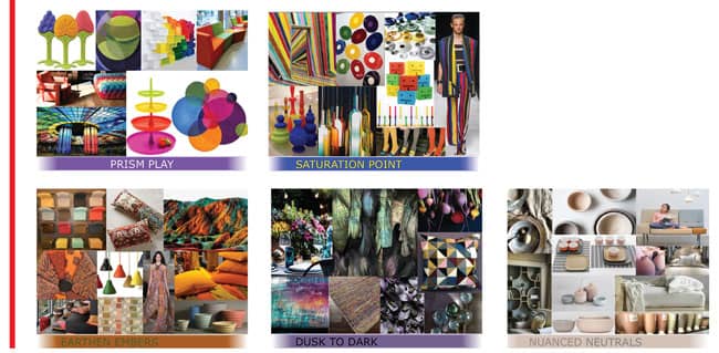 MORE COLOR PALATTES from Carpenter + Company’s Trendscape Color + Trend Spring/Summer 2016 report. Prism Play: Powerful punched up pink, orange and turquoise will sit with citrusy greens, grapes and bold blues to keep us smiling and optimistic. Clear sharp colors work together for clear, clean lines and simple structures. This Rainbow of hues is hot! Saturation Point: Sharp shards of saturated colors are jarring and provocative. Bold and bright, and not for the faint of heart. Playful and prismatic, they peak our interest in making a powerful, painterly statement. Nuance Neutrals: Nuanced neutrals of colored whites with a slightly peach or blush cast are paired with beige, taupe and soft warm whites. Warm grays continue as an anchor. Add a pale mint or ice blue and a touch of terracotta as an accent for a point of interest. Earthen Embers: Warm and tantalizing russets and burnt oranges lead the way with touches of teal and leafy greens and golds reminding us of the true splendor of changing Autumn leaves. |
Shopping Accessories
“Knowing the latest trends means absolutely nothing if you can’t put it into practice,” Resource Team’s Sharon Davis adds. “And to do that retailers have to be relatively organized before going to a show.” ART offers an exclusive discount to ART member retailers who shop select resources at market. A variety of retail furniture, home accent, design studio and lighting showrooms that are members of ART.
“Pre-market planning is a big deal,” Davis continues. “Do some research to find out what’s selling for you and what your customer is looking for. Get up to date on the latest colors and trends. If you know where you are, you will be ready to punch it up with new resources found at market. As an example, if you are using a wall art supplier whose core products are not performing as they should, perhaps the images or framing is dated. You may not even realize that until you see what’s trending out there. I’ve worked with a number of retailers that have never shopped accessories at High Point. Several of them just shopped New York, and there’s just no way in the world they could ever see the breadth of product that’s out there by having experienced one trade show in one region.
“Many rely on in store visits by reps, and don’t go to many markets. It’s easy to get into that rut. But trends and merchandising are changing quickly in our industry and most of ART’s vendors are working to stay on that leading edge. Retailers are not doing themselves much good if they don’t window shop the accessory floors at market because that’s where fabulous ideas come from. Vendor showrooms have different seasonal styles, so retailers can get all kinds of ideas about how to freshen things up, and also find new resources.
How To Get The Right Look
“So many times furniture stores buy a small smattering of accessories, display them in the store, but don’t do it with conviction, purpose, or intent, comments Global Views’ David Gebhart. “The stores that are most successful are the ones that really go for it, full-blown go for it, by making an important statement. There are several different ways to do it. Accessories can be used as just icing on a big cake, sprinkled around a furniture store, or retailers can create an accessory gallery within their stores. The people we work with who are the most successful do both.”
It’s important to buy across the whole range of function and material,” Gebhart continues. “So many people come in and buy just ceramic to add a pop of color to their furniture environments. That does work, but I think that they need to view accessories in a different way. They should look at them more from a point of view of how they function, how they work together. Focus on the whole picture with all the different categories and mediums of the accessory world represented. We have a lot of ceramic and porcelain, but we layer on glass, wood, metal, iron, in all different categories as well, from functional things, like candlesticks and boxes, to pure decorative items like bowls, and different kinds of ceramic pieces. When you come into one of our showrooms, you see everything merchandised in a very attractive, beautiful way. The people that are most successful with our lines are the ones that say, ‘I want to duplicate that in my store environment,’ instead of cherry picking.
“There are a lot of retailers in our industry that have created beautiful merchandising statements, but if you don’t have a team of people that are visionary enough to put together a merchandised look for your store, then rely on your resources to supply you with that look.”
The Phillips Collection’s Jason Phillips has a similar view. “In this day and age,” he says, “a successful store either has a gift for retail and they curate from hundreds of lines, or they find the right partners.
“Over the past 10 years I’ve noticed a big change in the types of economic stresses affecting retailers. When the recession hit, it weeded out stores. What’s left is a different selling landscape that includes young design start-ups that are into pushing brands, alongside seasoned store owners who are holding on to time tested ways of doing things, building great company brands. Either way, we are at a point where retail stores can successfully promote and exploit furniture and accessory brands. The time is right for more open sourcing in our industry.
“Here’s where I see retail going. I can’t see retailers having success cherry picking pieces from too many furniture and accessory lines. That used to make sense for retailers who wanted to be more anonymous about the lines they were buying. Now, with the Internet exposing everything, and with brands reaching out to consumers, we are seeing direct-to-consumer brand allegiance which all has to funnel back through the retail model. My point is, I’ve seen retailers having a lot of success following the Furnitureland South model, which is to represent brands in their retail showrooms. This store within a store presentation gives cohesive energy to presentations. It also facilitates training direct from the factory and allows retailers to better work with manufacturers’ design and marketing teams to provide catalogs, brochures, collateral materials, special websites, plus help with promotions and giveaways. This is the kind of partnership that results in more invested interest on both ends, creating synergy.
We asked Phillips if many stores lack the talent or vision to create great accessory presentations. His answer, “A lot of stores do not have the kind of manpower to do a good job. The solution is to bring in the right accessory vendors and say, ‘Hey, help me liven this area of the showroom up.’ Retailers need to start speaking a little bit more. We’re all there to help each other.
[“source=furninfo”]