LinkedIn, the professional social network, has recently launched a new app for iPhone – LinkedIn Connected. This app, which replaces the old LinkedIn Contacts app on iOS, is LinkedIn’s attempt at changing how you connect with professionals in your network. It is only available in a few countries including the US at the moment.
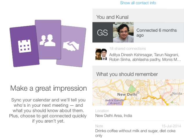
LinkedIn Connected essentially lets you view all your LinkedIn contacts, and syncs them to your phone’s address book. Inside the app, your contacts are displayed as cards that show LinkedIn profiles, location and your notes on that person. For instance, if you have an interview with a person, you can add a note like, “Remember to ask about her upcoming concert”, and then when you check their card before the meeting, you have all the information you need at hand.

We tried the app for a few days and here’s what we thought about it.
LinkedIn Connected does a great job in terms of design. It uses a card-based design, and each card has a picture of your contact, details of upcoming events (meetings, birthdays, work anniversaries, etc.) and a button for an action (congratulate, connect, etc.) below. You can sort through the day’s events by swiping sideways and tap any card to quickly check a person’s background. Since you can sync it to your phone’s calendar, you can see upcoming meetings in the app, and can send you reminders as well. It’s hard to justify using this as your primary calendar, as other apps serve that purpose much better.
LinkedIn Connected might appeal to those who do all their networking on LinkedIn, but if you haven’t updated your LinkedIn profile, then this feature might not be so useful. On our account, most of the updates we got were people joining a new company or someone’s birthday.
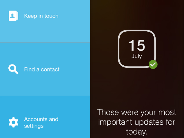
Swiping down from the top shows you three options – Keep in touch, Find a contact and Accounts and settings. The first option takes you back to LinkedIn Connected’s cards, while Find a contact does what the name suggests. Accounts and settings lets you configure which services (contacts, calendars, etc.) you want to sync with LinkedIn Connected, and is also where you can sign out.
If you go back to the cards, when you keep swiping to the right, you’ll soon reach the last of the day’s most important events. If you swipe to the right here, you’ll see contact suggestions, which is just an endless stream of people LinkedIn wants you to connect with. Getting back to your most important events from there is difficult – you’ll have to swipe back all the way. For an app that is so design-driven, not having an easy way to return to the first card is a big problem.
 LinkedIn Connected is essentially a prettier, less annoying way to get notifications from the network, when compared to the several emails that it tends to send every day. If you use email for networking, then you might want to try LinkedIn-owned Rapportive, which is a Gmail extension that shows you background details about the person you are having conversations with.
(Also see: Seven Extensions That Make Gmail Better)
LinkedIn’s main app has a lot more features such as status updates, links to articles, news, photos, comments, etc. If you want to do away with all of that and only focus on connecting with other professionals, then LinkedIn Connected might be what you seek. If you’re looking for a killer contacts app though, then this doesn’t quite cut it.


