Instagram Overhauls Apps, Logo With Latest Update
HIGHLIGHTS
Instagram’s updated Android and iOS apps now available to all.
The social app now has a new more colourful logo.
Instagram has gone with a black and white theme for its apps.
Facebook-owned Instagram on Thursday redesigned its logo and even released an app update for iPhone and Android users. The new logo is envisioned with the aim to make it look more vibrant and colourful, and the update brings a simpler design that is aimed at highlighting the community’s pictures and videos..
The updated Instagram apps have arrived on the App Store and Google Play. Beginning with the logo, Instagram has kept the idea behind the old logo alive in the new logo – retaining the camera and the rainbow. It is now more colourful, and the the brown coloured camera is completely gone, replaced with rainbow gradient in the background with just a white outline of the camera.
Ian Spalter, head of design at Instagram, explains in a Medium post why the company felt the need to change the logo. It was “beginning to feel, well… not reflective of the community, and we thought we could make it better.”
Instagram_new_logo.jpg
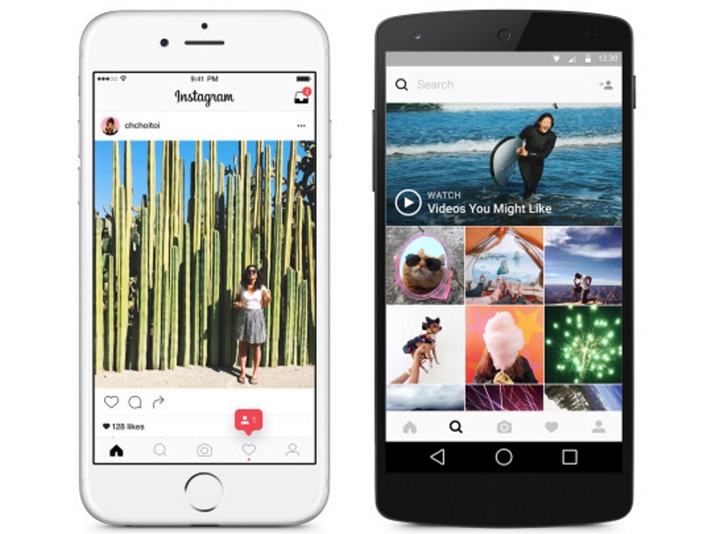
The interface of the apps also saw a major overhaul in terms of design. Instagram has got rid of all the blue, and a new black and white theme now dominates the entire app. The blue bar on top that housed the direct message icon on the right, and the blackish bar at the bottom that had all the navigation options, are now both white. The fonts throughout are now solid black and the background is stark white.
There is no change in navigation, so the experience of browsing through the app is not dramatically different. Instagram reasons the black and white theme as an effort to “put more focus on users’ photos and videos”.
Instagram has grown a lot since its inception in 2010. The social app now has around 80 million photos and videos being uploaded to its app every day.
Tags: Apps, Instagram, Social
[“Source-Gadgets”]


